Minimal Nativity

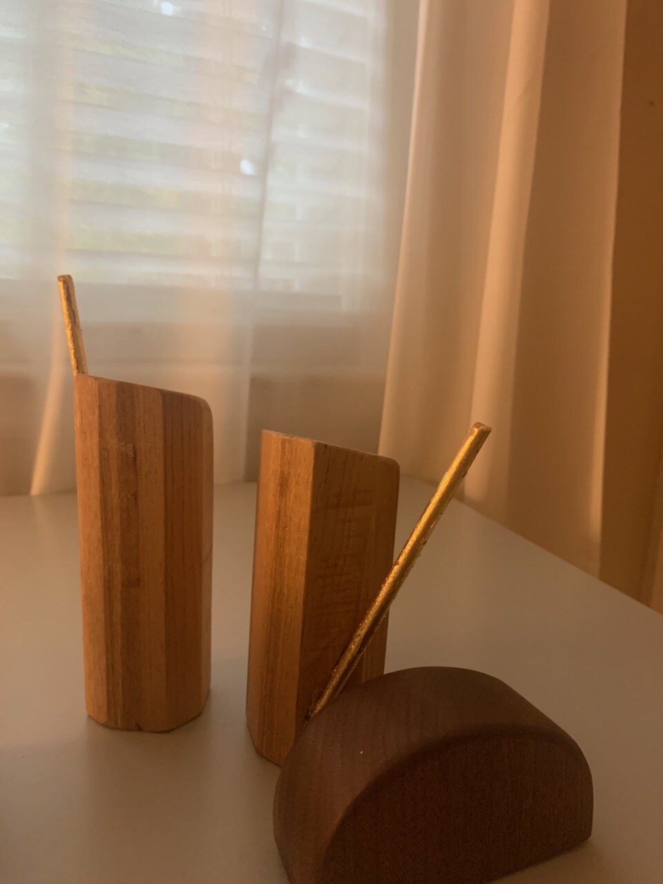
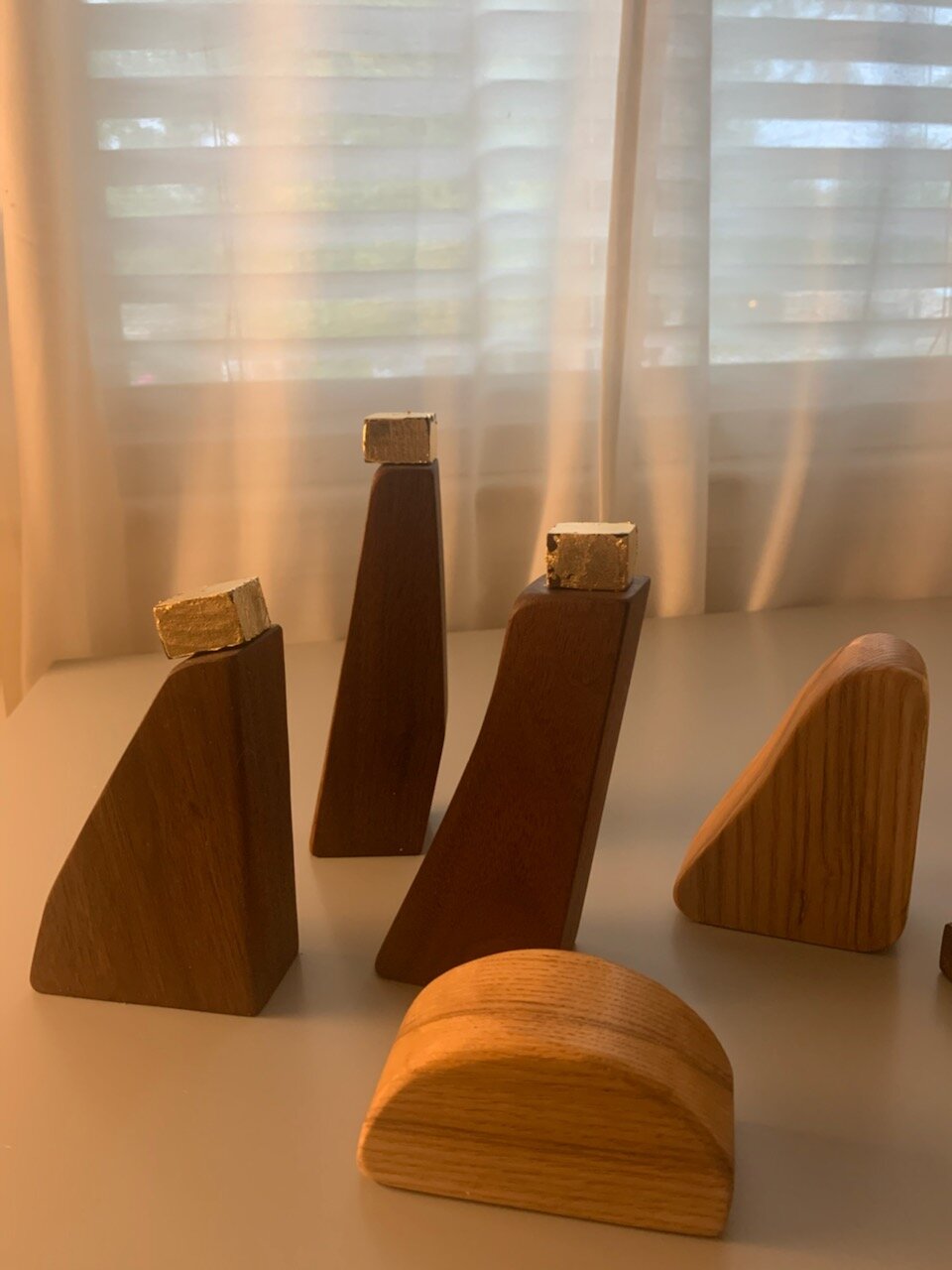
In my endeavor to do art for fun, I started this project about three years ago. I wanted to make a nativity set for our home, but as you can read in the blogs below, my carving skills aren’t up to par, so I worked with my strengths and went minimal.

I wanted to give the impressions of the characters while using the fewest lines I could. Hopefully by looking at what are essentially randomly shaped blocks, you might instantly see Mary, Joseph, Jesus, and the rest of the Christmas posse. Now that I think of it, minimalism suits the idea of the nativity just fine. What was this gaggle of folks if not simple, albeit, glorious?

While I might have a combined 10 hours of cutting and sanding, it took three years to complete. I am glad to finally see it indoors. I used ash and walnut with gold leaf highlights. What are your favorite pieces?

IMG_5552.JPG

Legendary Chopsticks

While in London last summer, I looked in the utensil drawer of the AirBnB we were staying at and saw four sets of hand-carved chopsticks. My immediate thought was “And why have I never done this??”

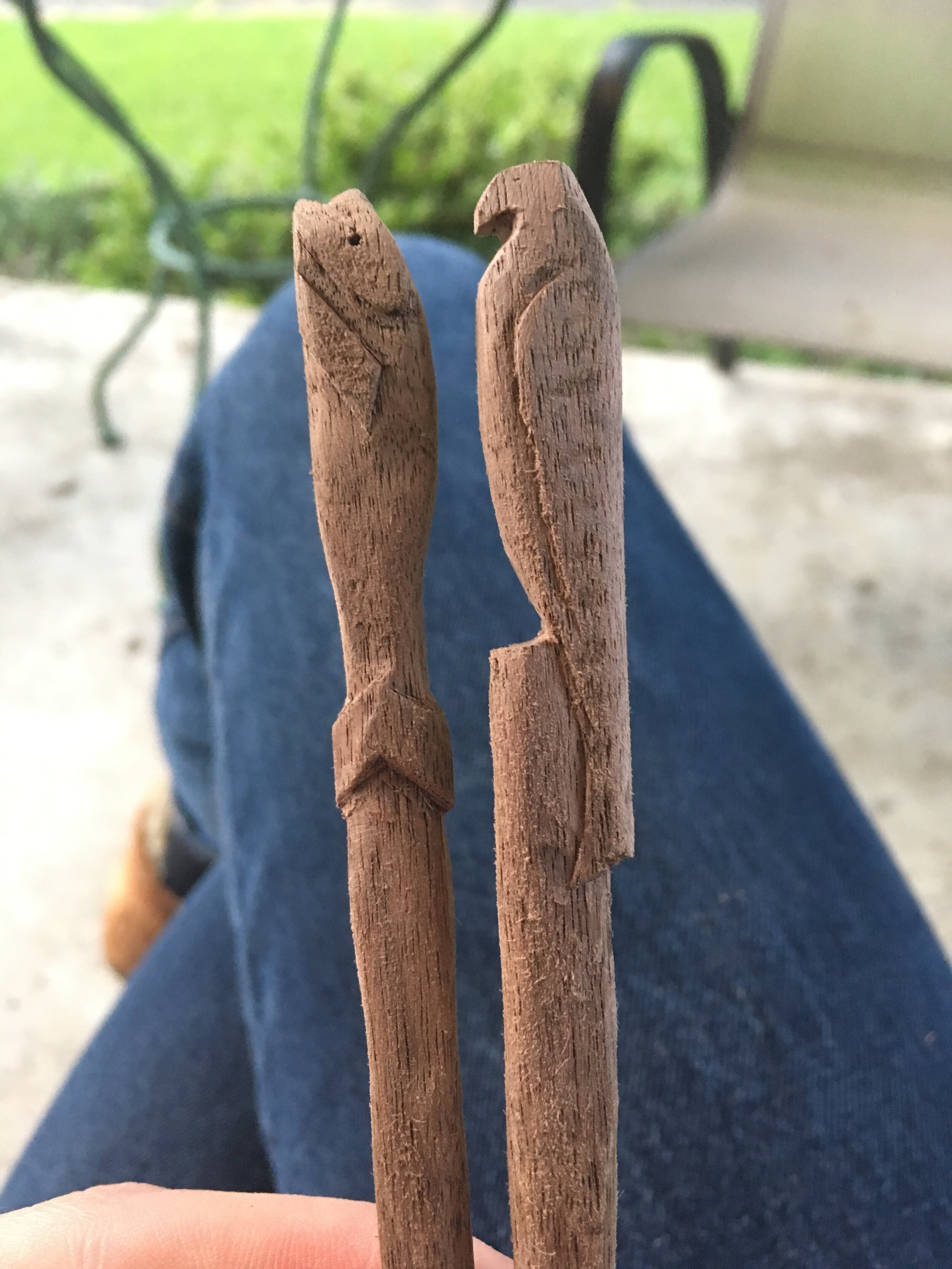
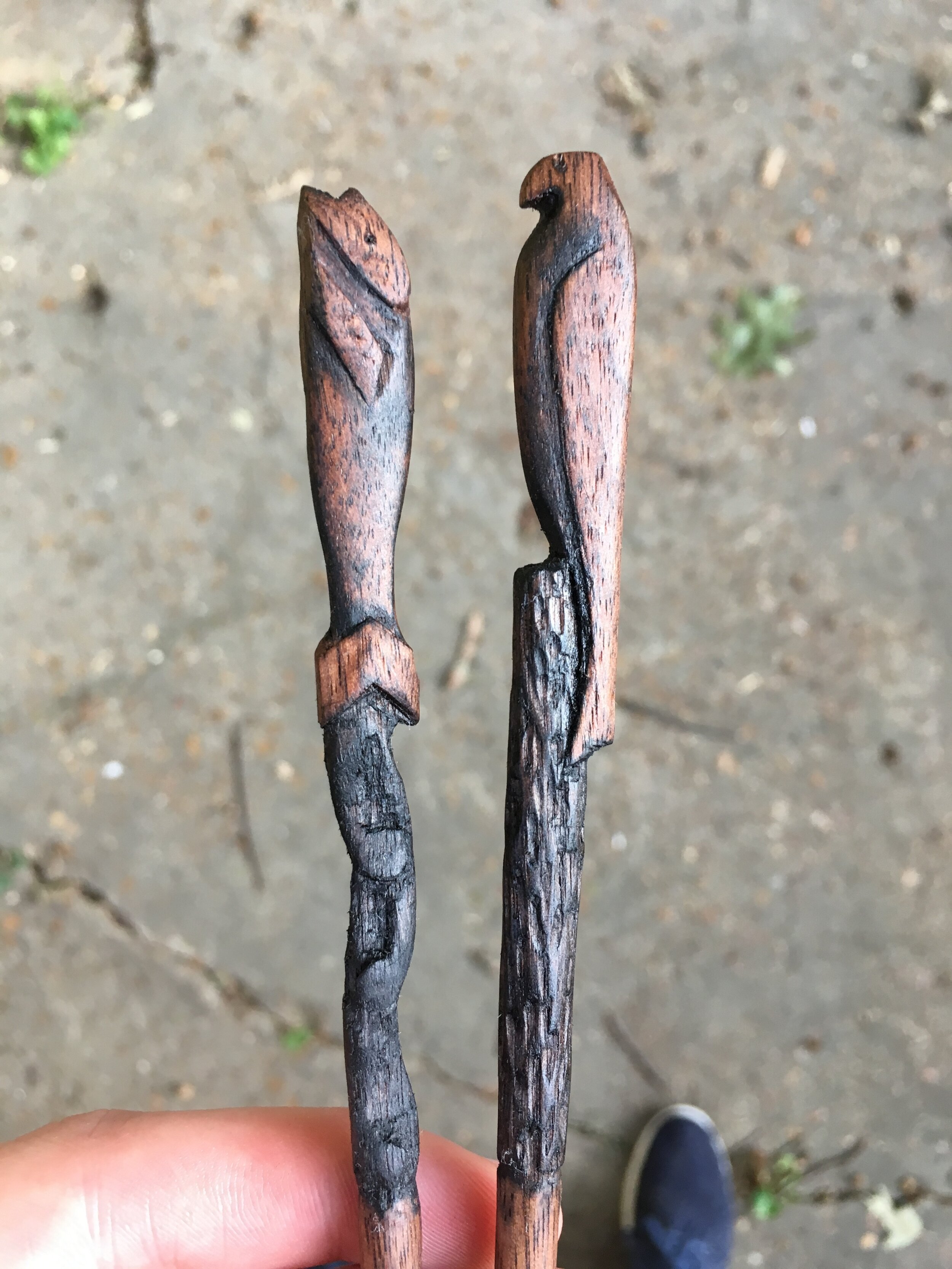
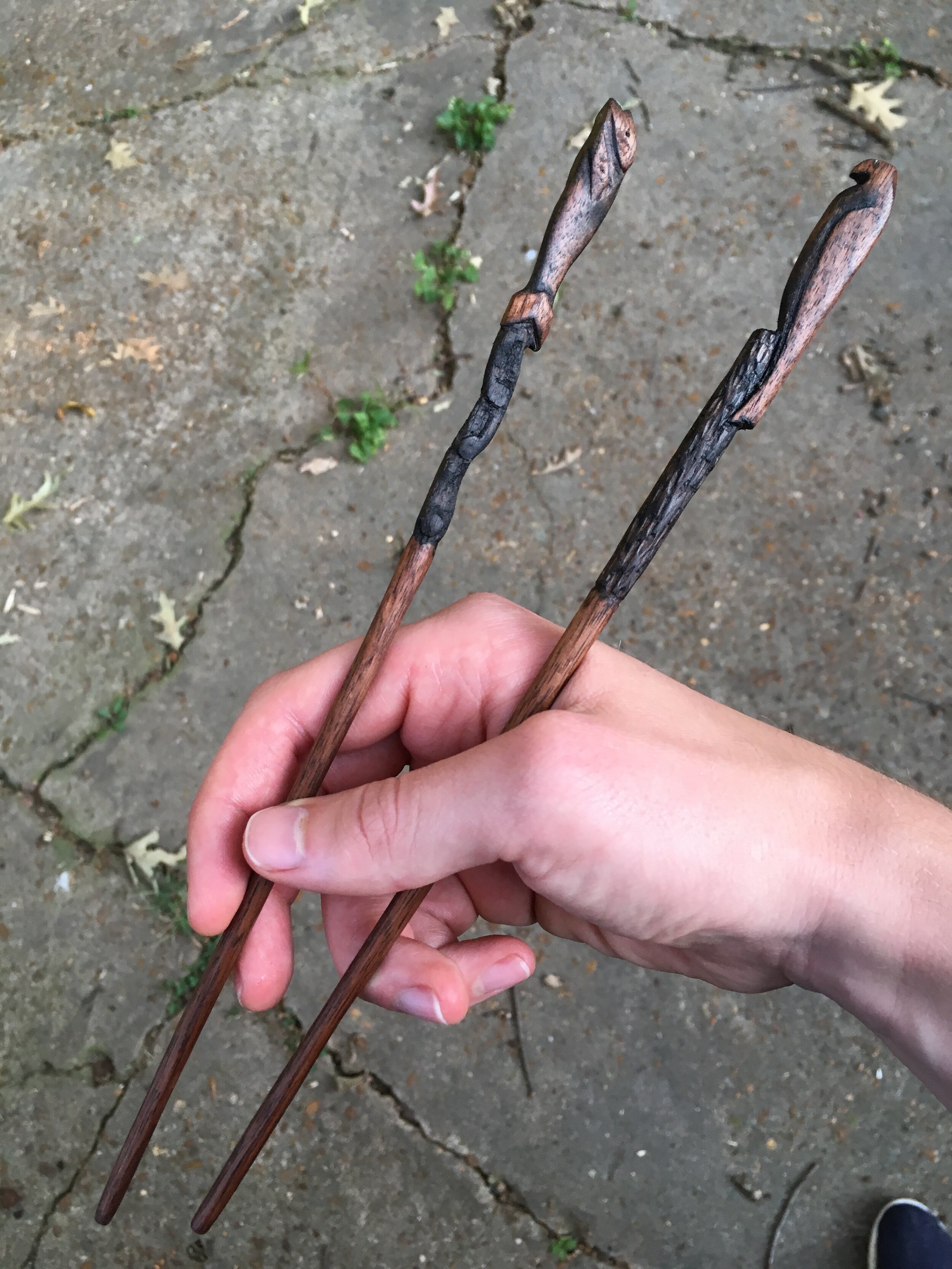
So I began. I’ve always wanted to practice carving, so this is my chance on a small scale. Deciding to go a more illustrative route (as opposed to decorative shapes and patterns) I settled on whittling the characters of the almost certainly untrue legend of how sushi was invented.

Supposedly an elderly woman in feudal Japan was constantly having her large pots of rice stolen by local thieves. One day she decided to hide the jars in a famously huge osprey nest. When she came up to retrieve them, she found that the osprey herself had used the jars as storage… for her freshly caught fish.

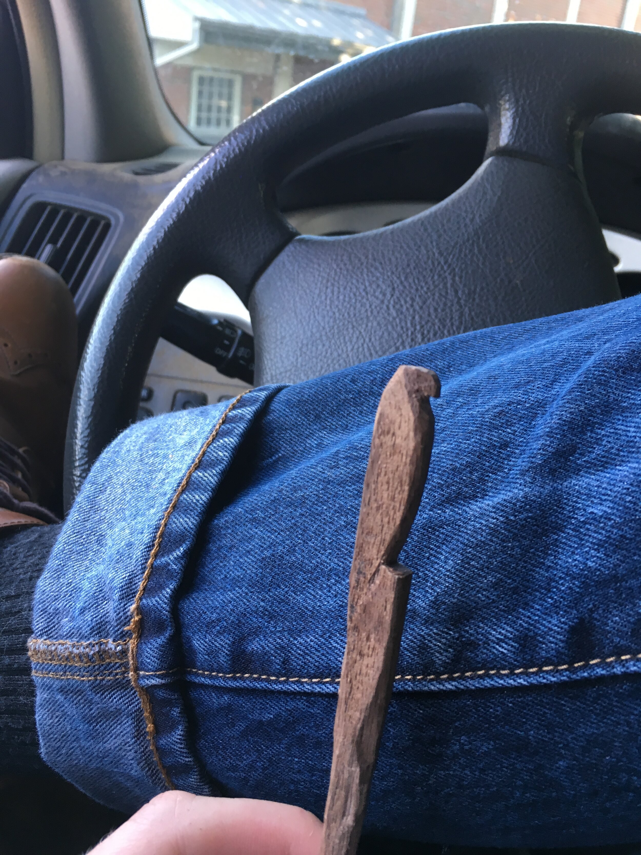
Thus, I started with the osprey and the fish. After drawing some sketches, I had the general ideas mapped out. I picked walnut as the base because, while it is generally a straight grained hardwood with no pores, it is still luxurious enough to be eating from. My pocket knife and linoleum block cutter were my tools.

Despite the seeming simplicity, it took almost three months of “waiting in the car” type carving. To finish, I used the trusty steel wool ebonizing stain for some darkness in the recesses, then sanded the highlights. I then soaked them in some mineral oil for food safety. The “water” behind the fish needs a little work and the sticks themselves feel a bit too long, but I love the osprey perched in the contracting textured “log” and the overall mineral finish.

Agnus Dei

agnus-dei-0884.jpg

Last fall I was thinking about the end of the world. Or really I guess just the end of things as we know them (eschatology for the nerds among us). Somehow, call it inspiration, but I got the image in my head of the classic Christian motif of the Agnus Dei, which generally looks like a lamb carrying a flag with a cross on it. But instead of the cross, I thought of it being a white flag. After all, the victory of Jesus didn’t happen because of a fight, but because of a surrender.

I had been also wanting to recreate some of the printmaking techniques I learned in school, so once this more illustrative idea came up, I just combined it. I started with a “mockup”: just a 2” x 4” linoleum block that I could print using a wooden spoon. Minus the backwards P, I loved the overall look of it. It reminded me of some old early Christian catacomb painting or medieval manuscript.

I decided to go bigger. I included more detail along with the words “give” and “take”. These bring up verses like “The Lord gives, and the Lord takes away” (Job 1:21), “Behold the Lamb of God who takes away the sin of the world!” (John 1:29). One would’ve thought I may have learned my lesson from the mockup, but alas, the words came out backwards. Also the transfer wasn’t as even as I would’ve liked. I appreciate the detail in the flag and coat, but otherwise it just doesn’t have the same punch and the small version.

Out of this I am more interested in the subject matter. It is instantly recognizable, but carries different, less used baggage than a cross. It feels more hopeful too.

IMG_2097.JPG
IMG_E2261.JPG

Tea Box

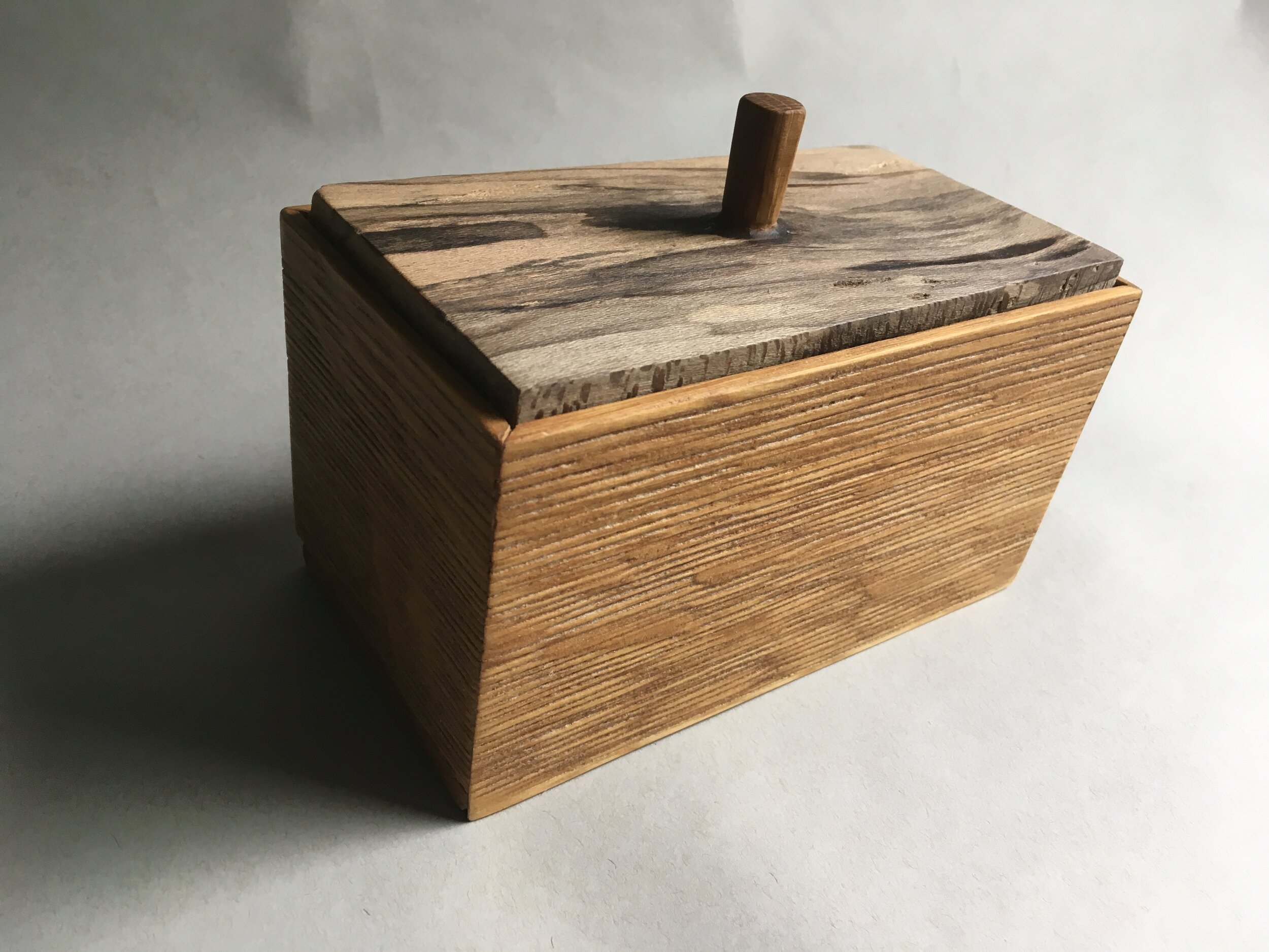
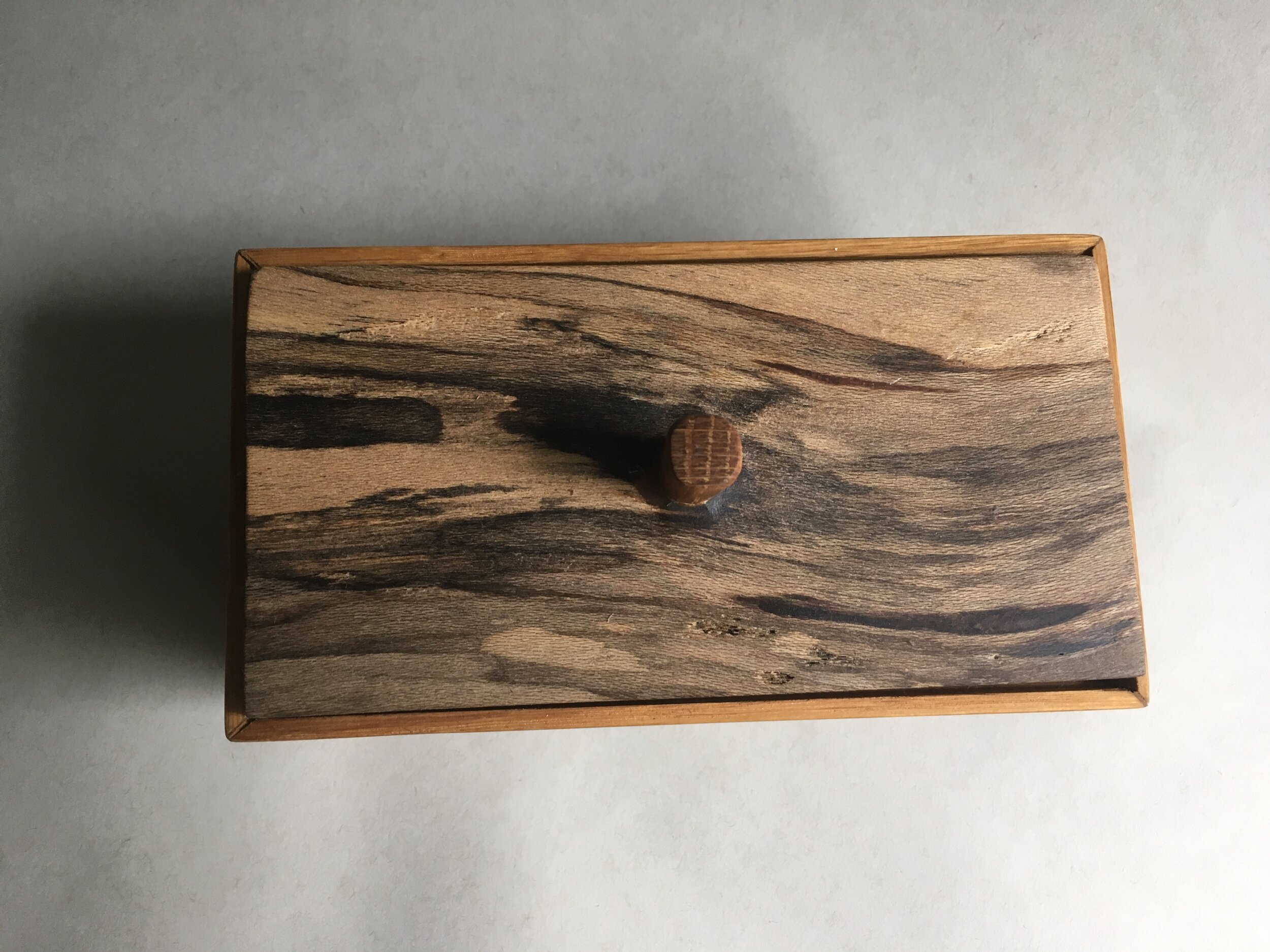
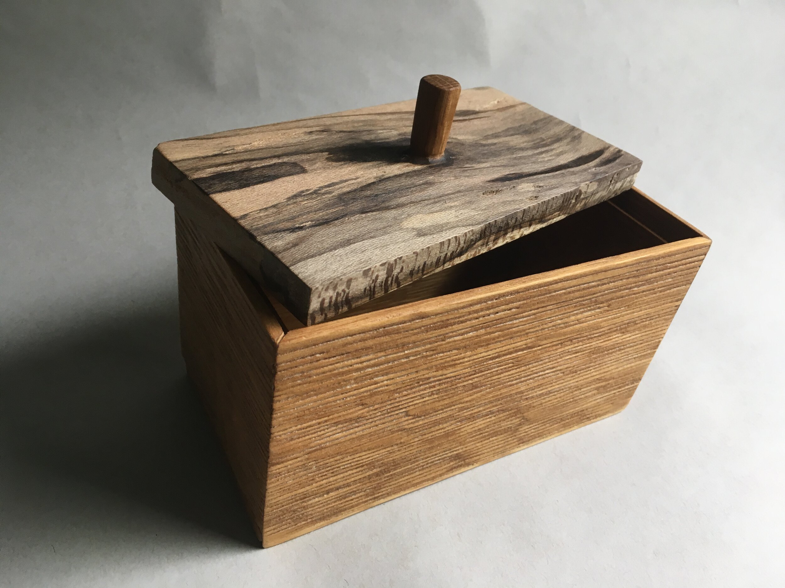
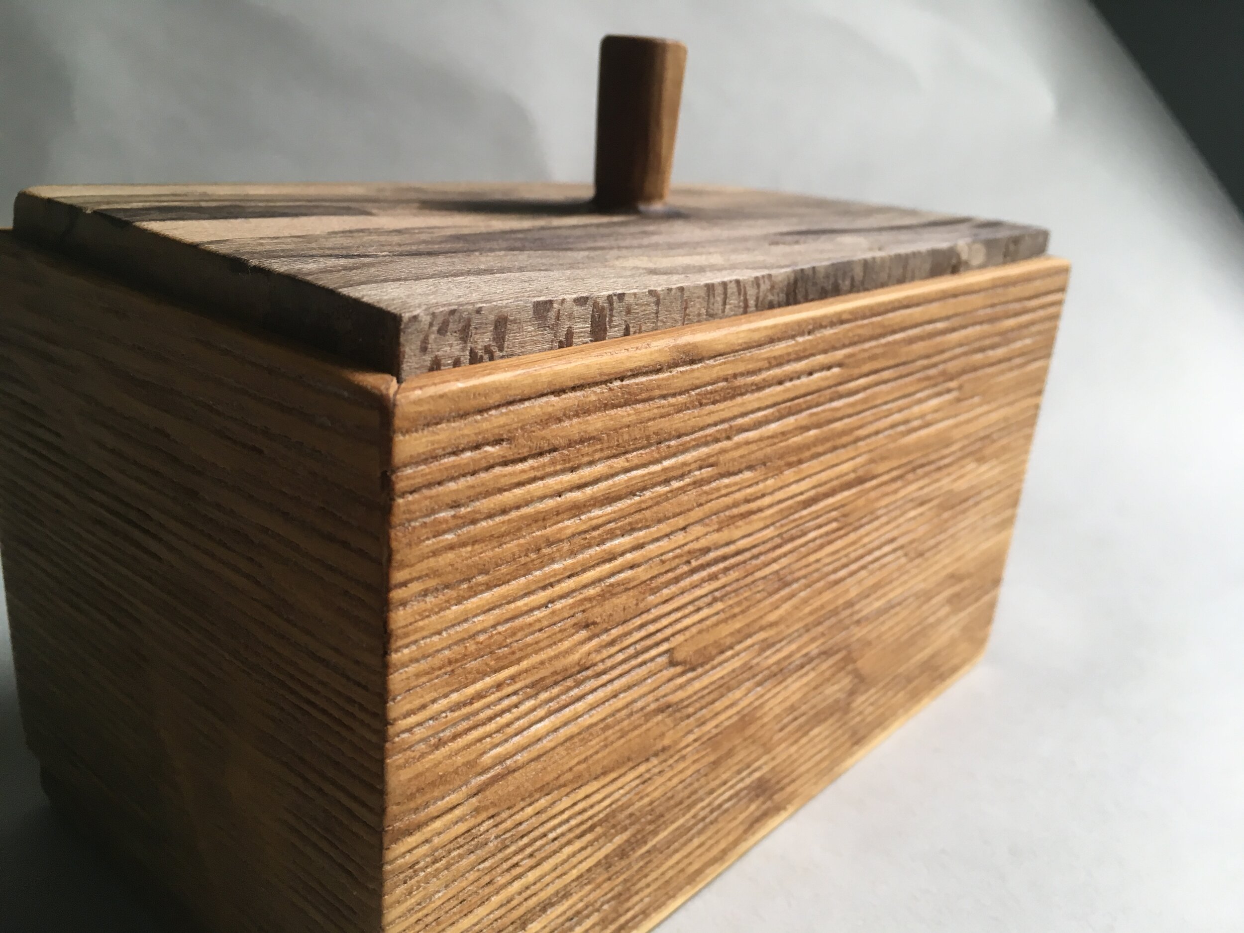
I got really into tea about a year ago, and there is a plethora of tea box examples throughout woodworking. I was intrigued by one I saw that had deep grain texture down the sides. So I used white oak, which was tough enough, but grainy enough, to sustain a few seconds with a sand blaster.

I cut the lid from a spalted piece of sycamore. It’s color and softness contrasted nicely. I bored and glued the oak knob with some difficulty (there was tearout I had to resin fill). For finishing, I used danish oil and coated it with paste wax.

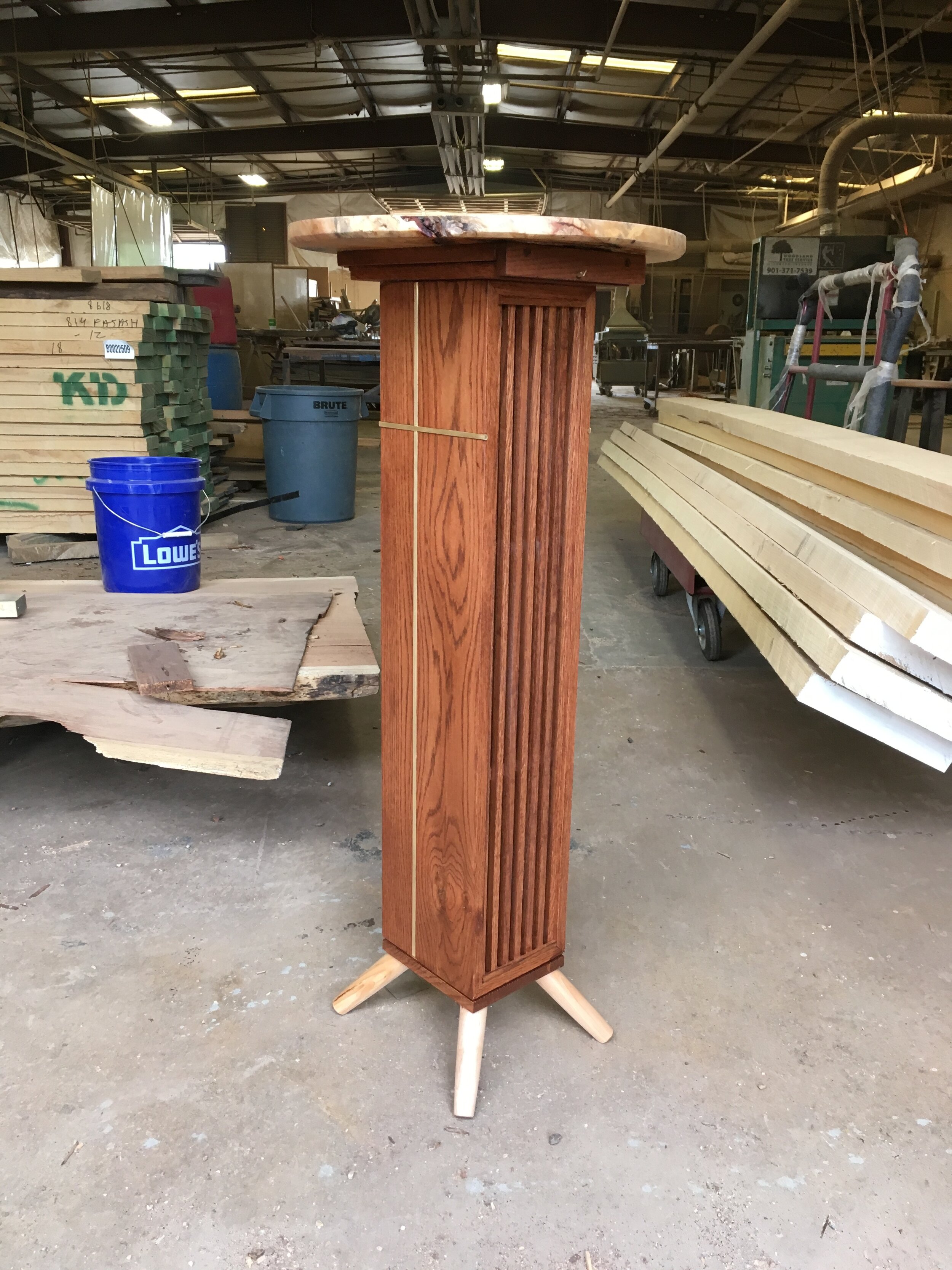
Pastor's Pulpit

In the Gallery at FineWoodworking!

Yet another commission from the lovely folks of Christ City allowed me to build a lectern from which our pastors could preach. I was stoked.

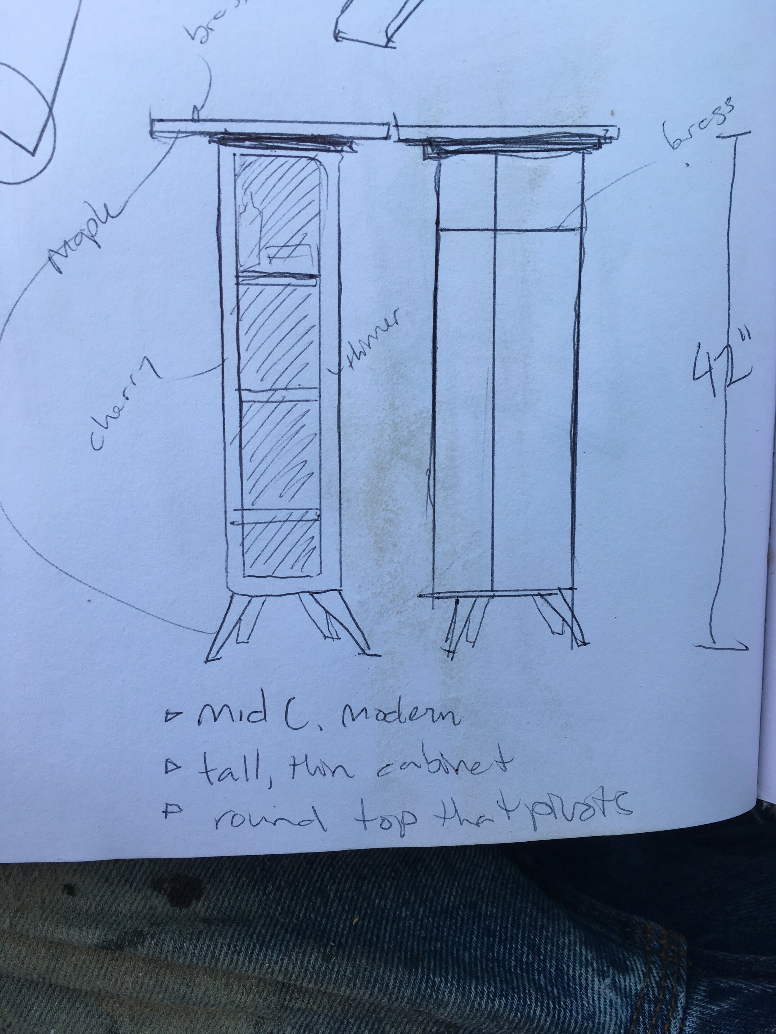
We had just moved into a new building for worship, so I had a pre-existing aesthetic of 60s-70s quazi modern straight verticals in a warm red oak to think about. Should I match it or contrast it? An organic, obsidian black podium would definitely make a statement, but I had gone that way before (see below blog) and decided to go with the grain on this one.

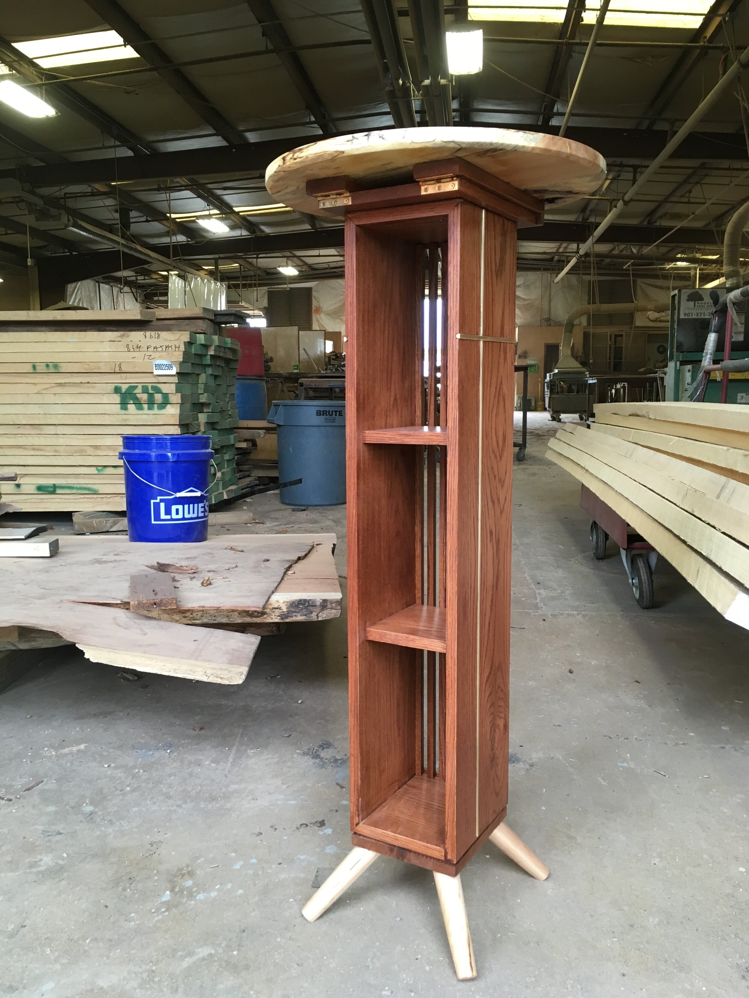
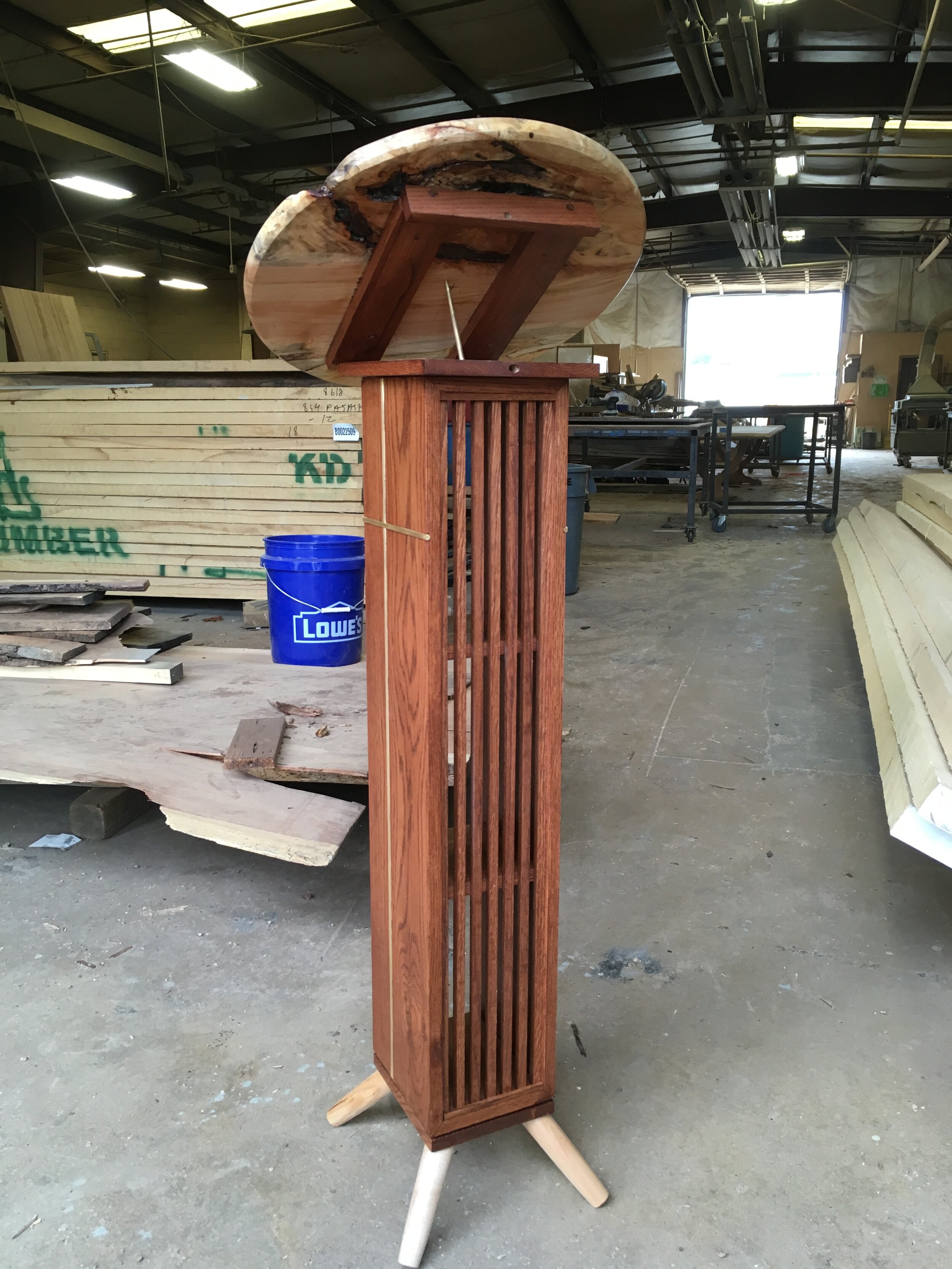
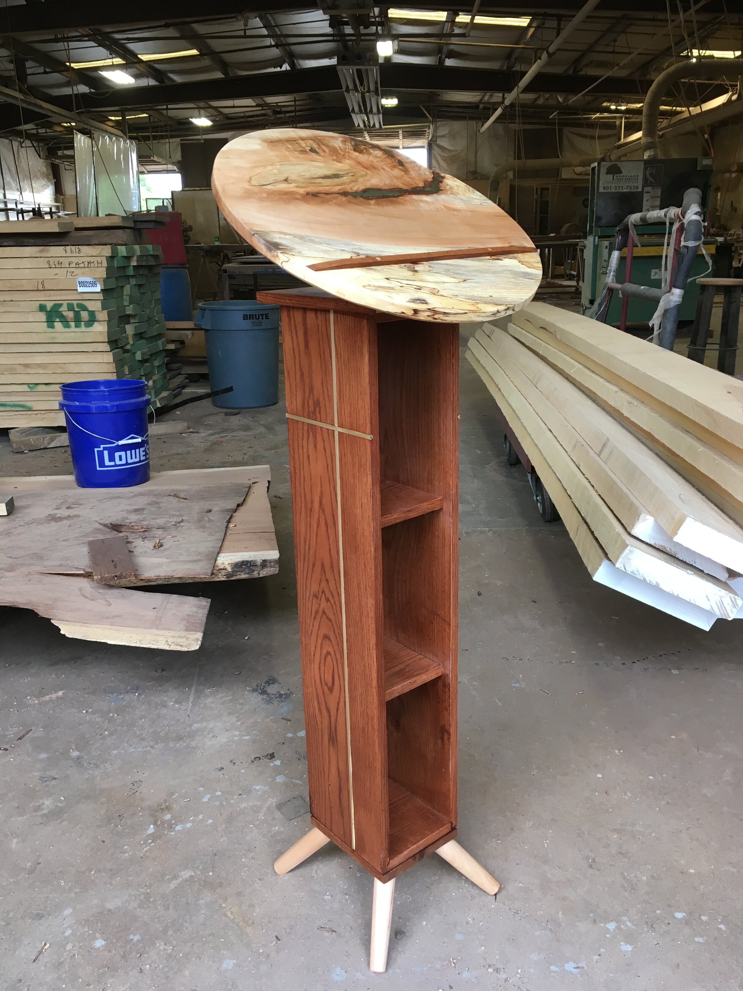
The sanctuary looks like it wanted to be cool with mid-century modern style, but needed to back off a bit to not be so hip. Thus there is a kind of dusty, endearing minimalism one might enjoy in a hospital chapel or a 1970’s wood paneled living room. It’s sparse, but still warm and rich. Going off that I went with a dowel base, round top, and vertically oriented parallel lines.

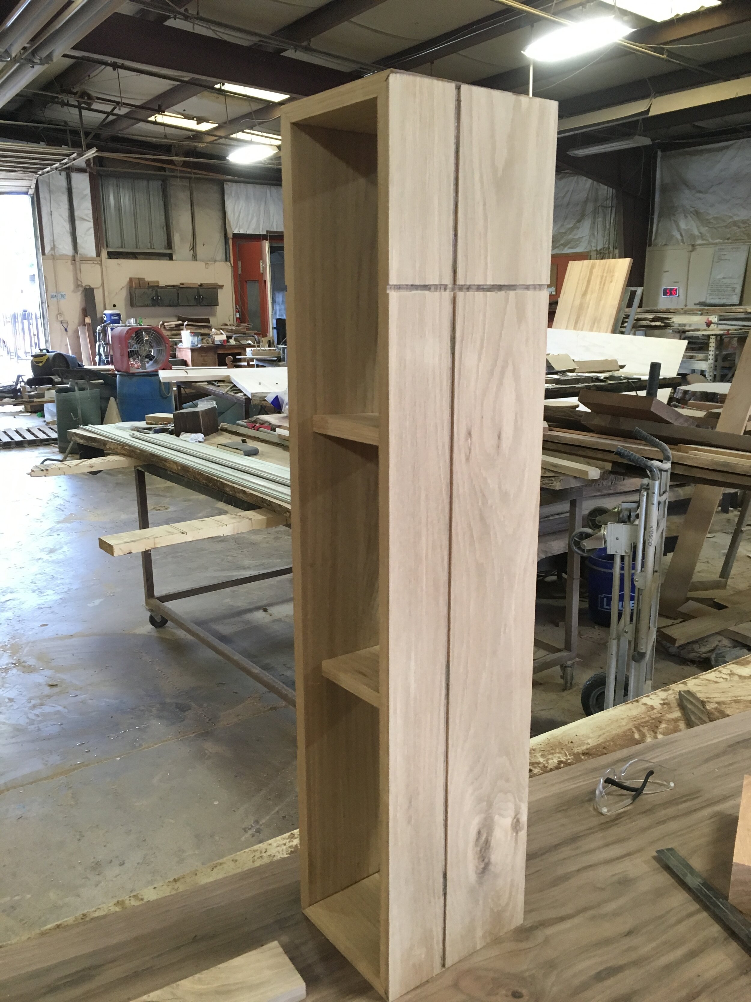
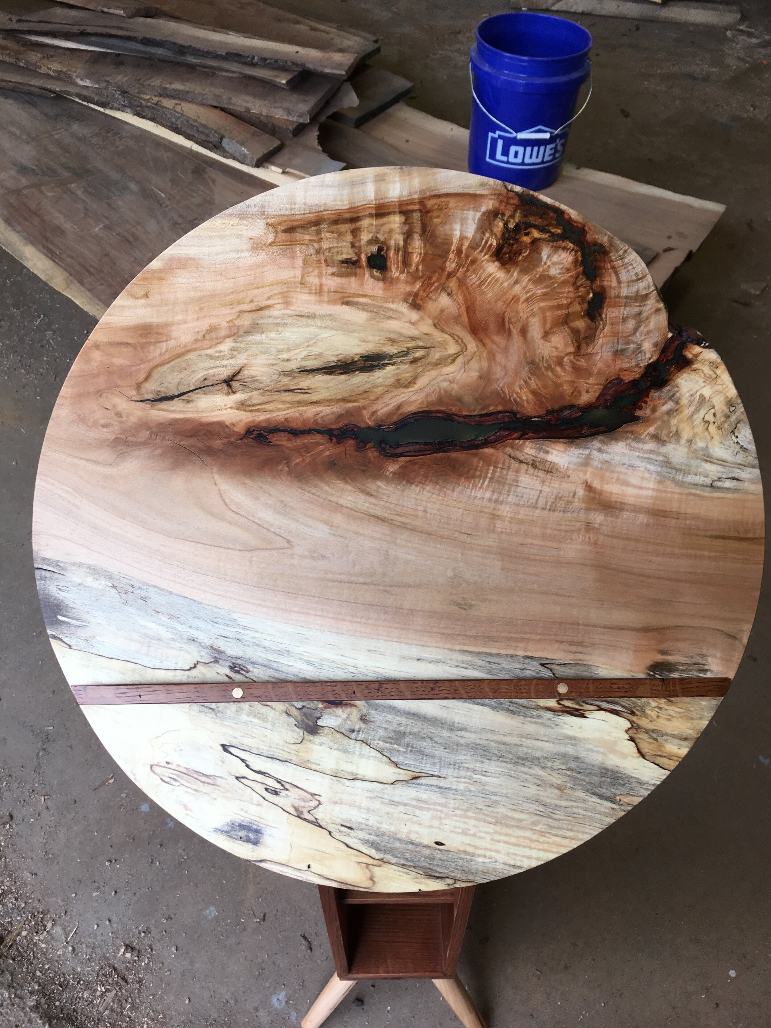
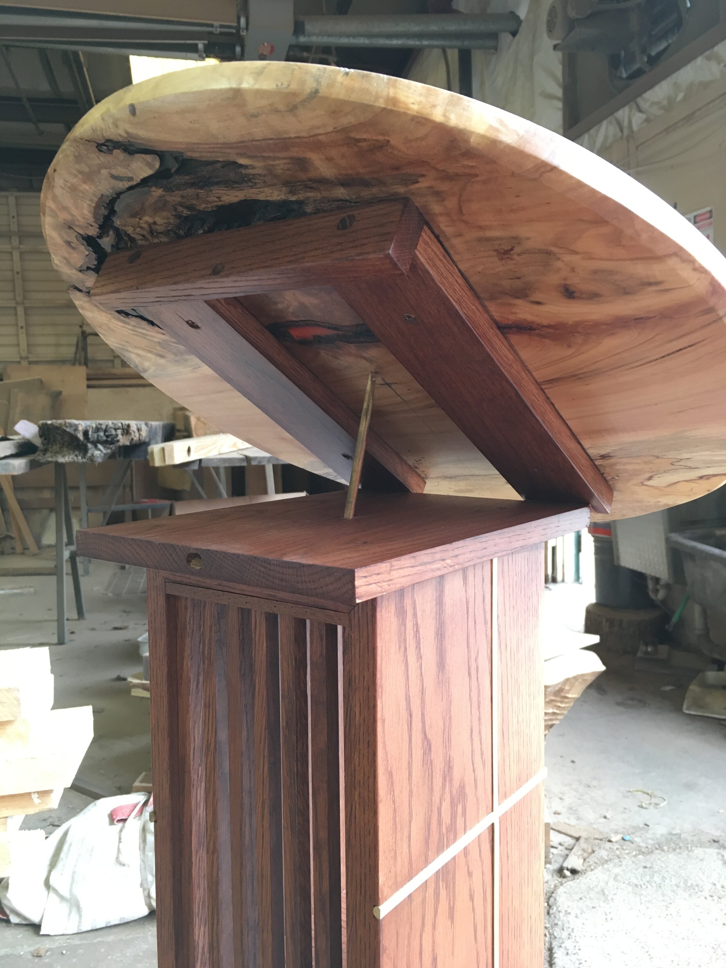
The top needed to be able to adjust from horizontal to diagonal with minimal effort, so I routed out the spalted maple top and had it both lock in place and tilt upward by using a small brass pin. The pin acts as a kind of kickstand when in use. The shelves are spaced apart enough to allow an average height water bottle. The entire piece is a smidge taller than counter height.

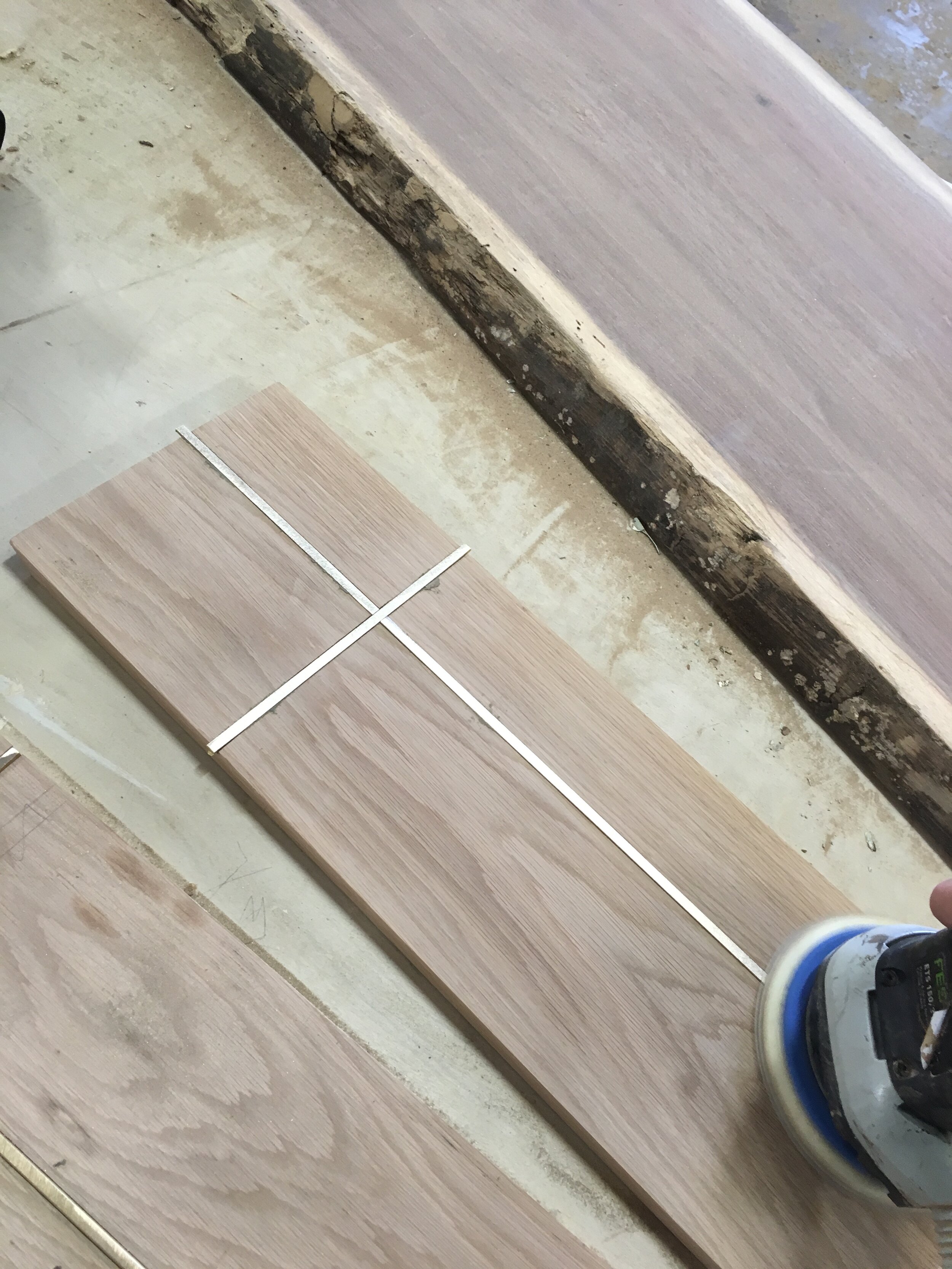
One of my favorite details is the off-centered brass crosses on either side of the main body. I used brass rods to inlay into grooves cut on the dado saw. In hindsight, I should have bought brass square stock instead of round, because I spent a few hours sanding down the convex half round of the rod until it was flush… ‘Tis the nature of learning I suppose.

Overall I am very proud of this piece. In terms of craft, it might be one of my best. Going back, I would shorten it, fiddle with the ends of the rods, and maybe make the tilt mechanism a little more sophisticated, but in all, I like it in the space. It blends in, but like the hip pastor’s sneaks in the photo, is still fancy enough to notice…

IMG_1268.JPG

Christ City Entrance Sign

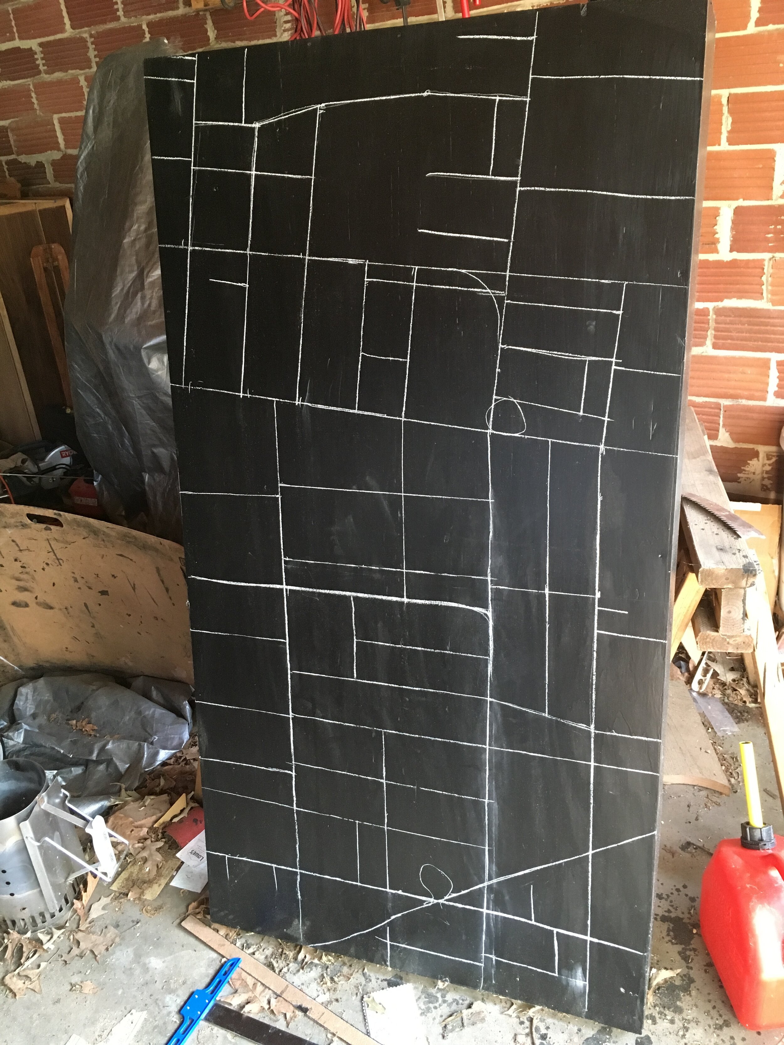
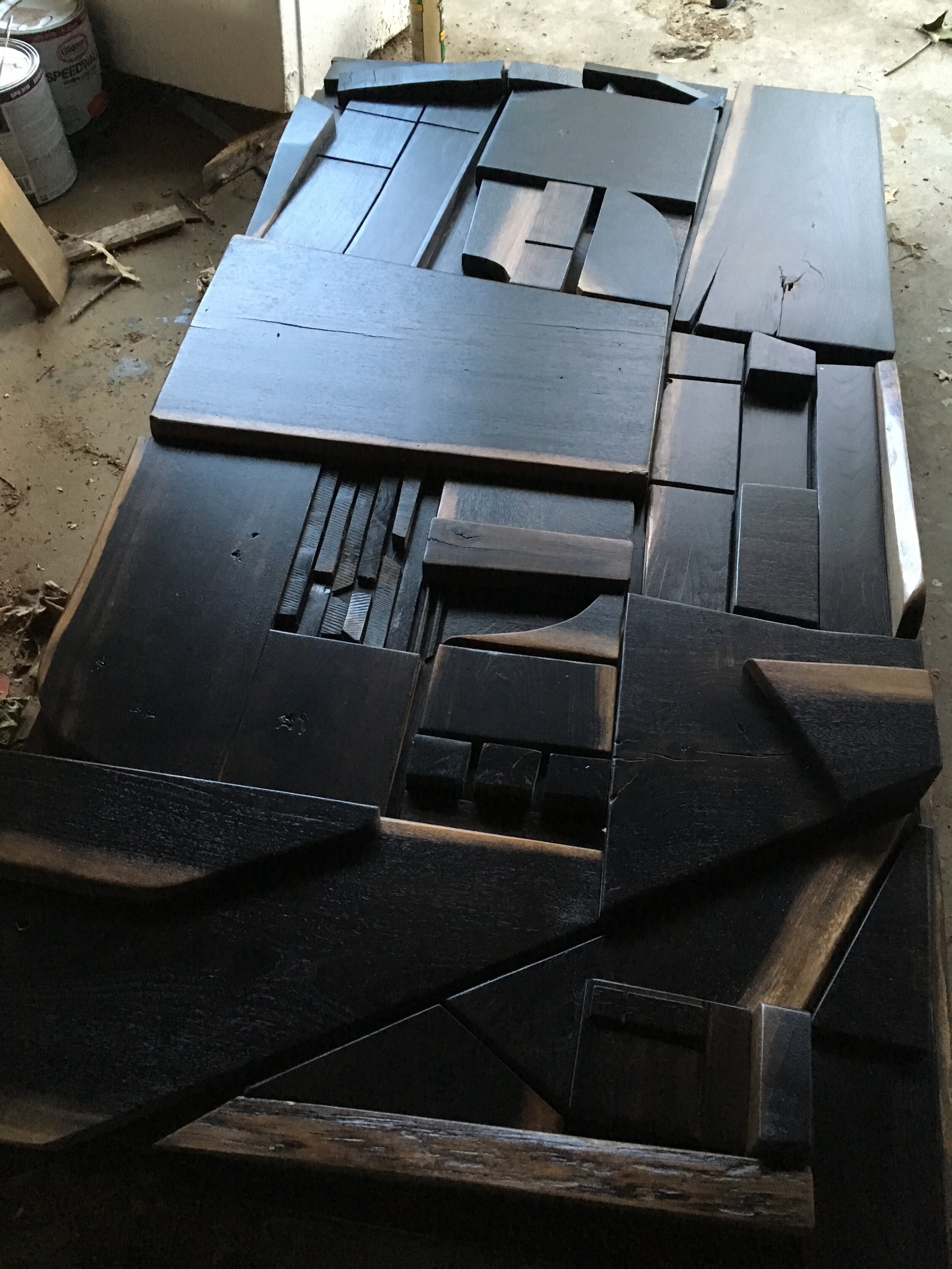
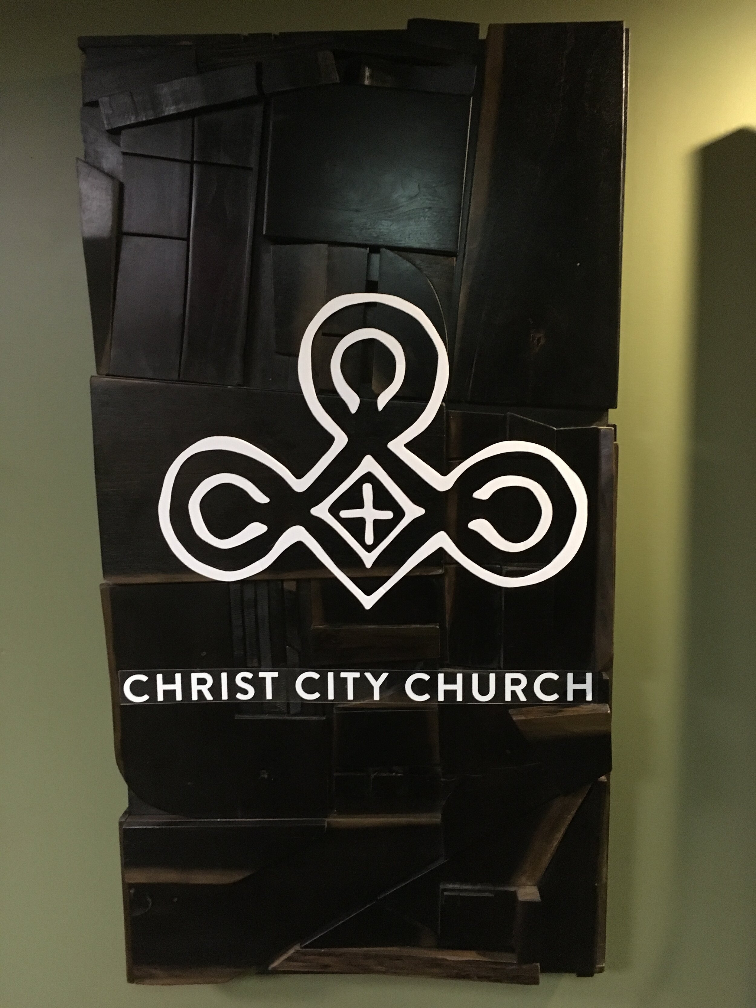
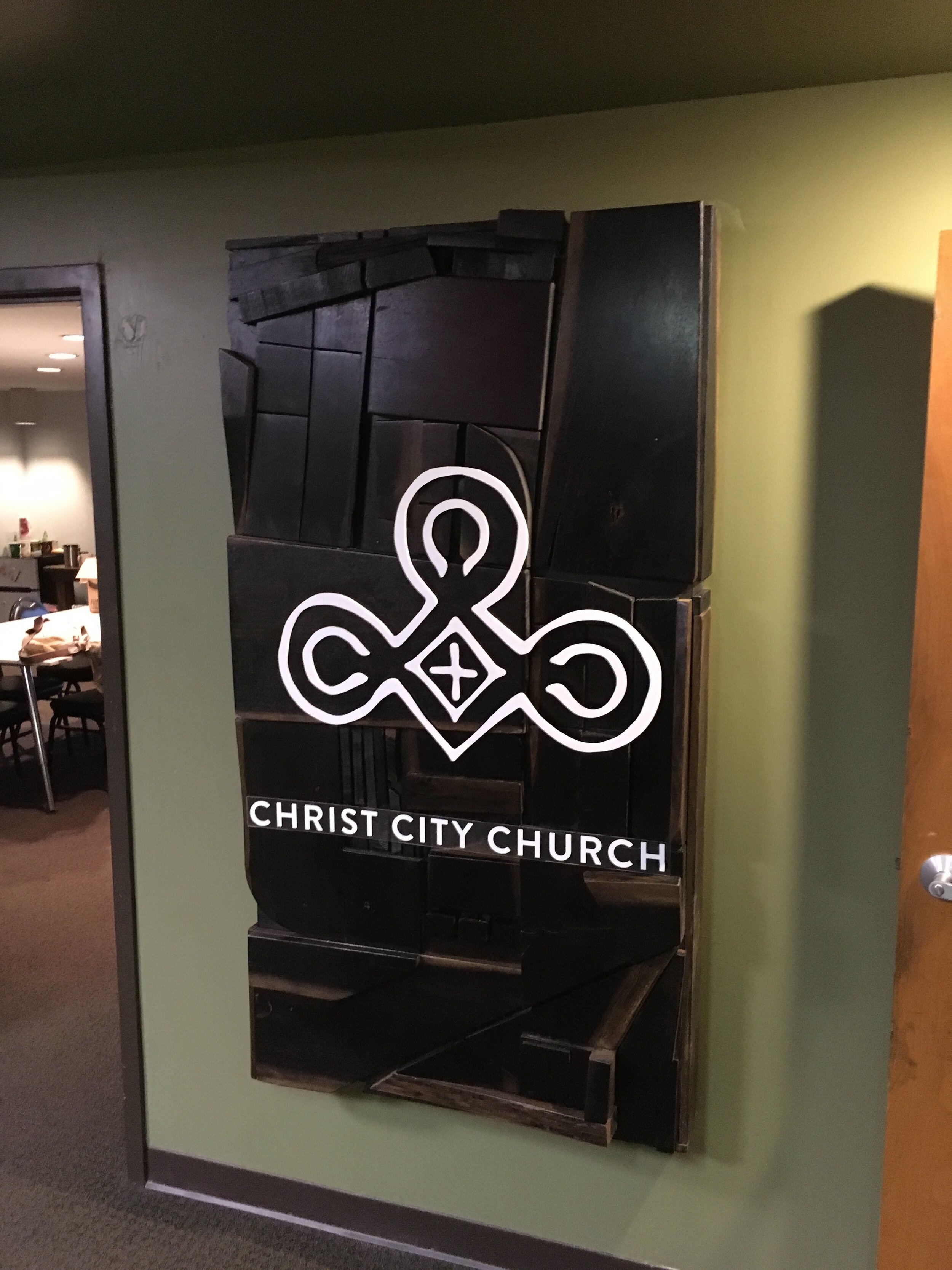
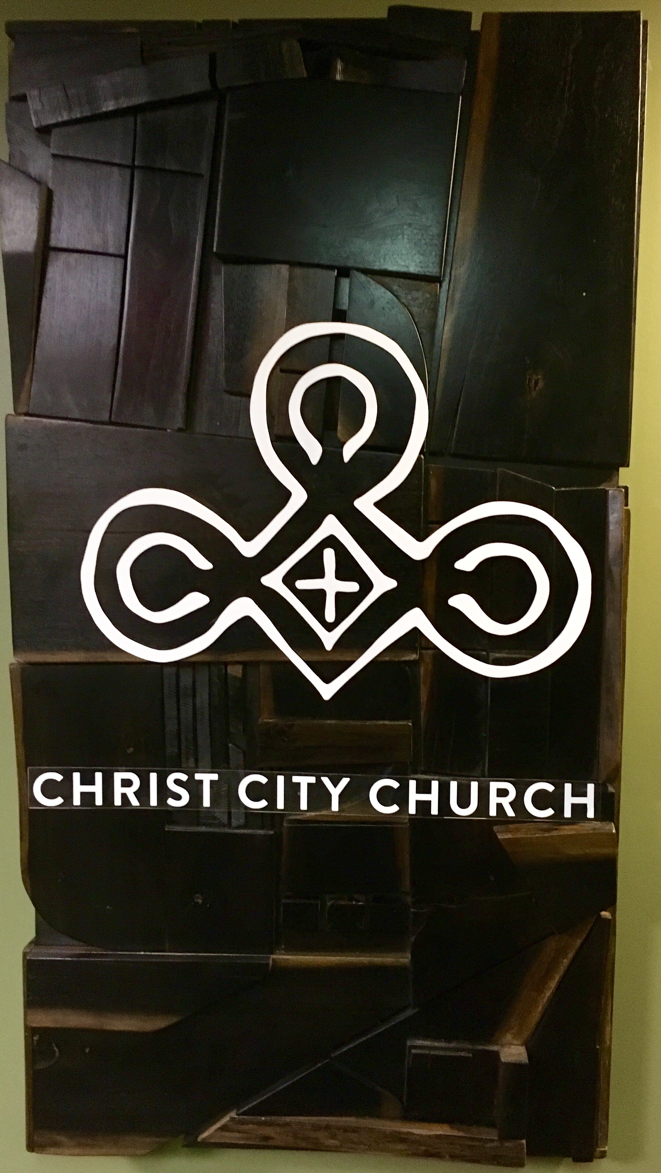
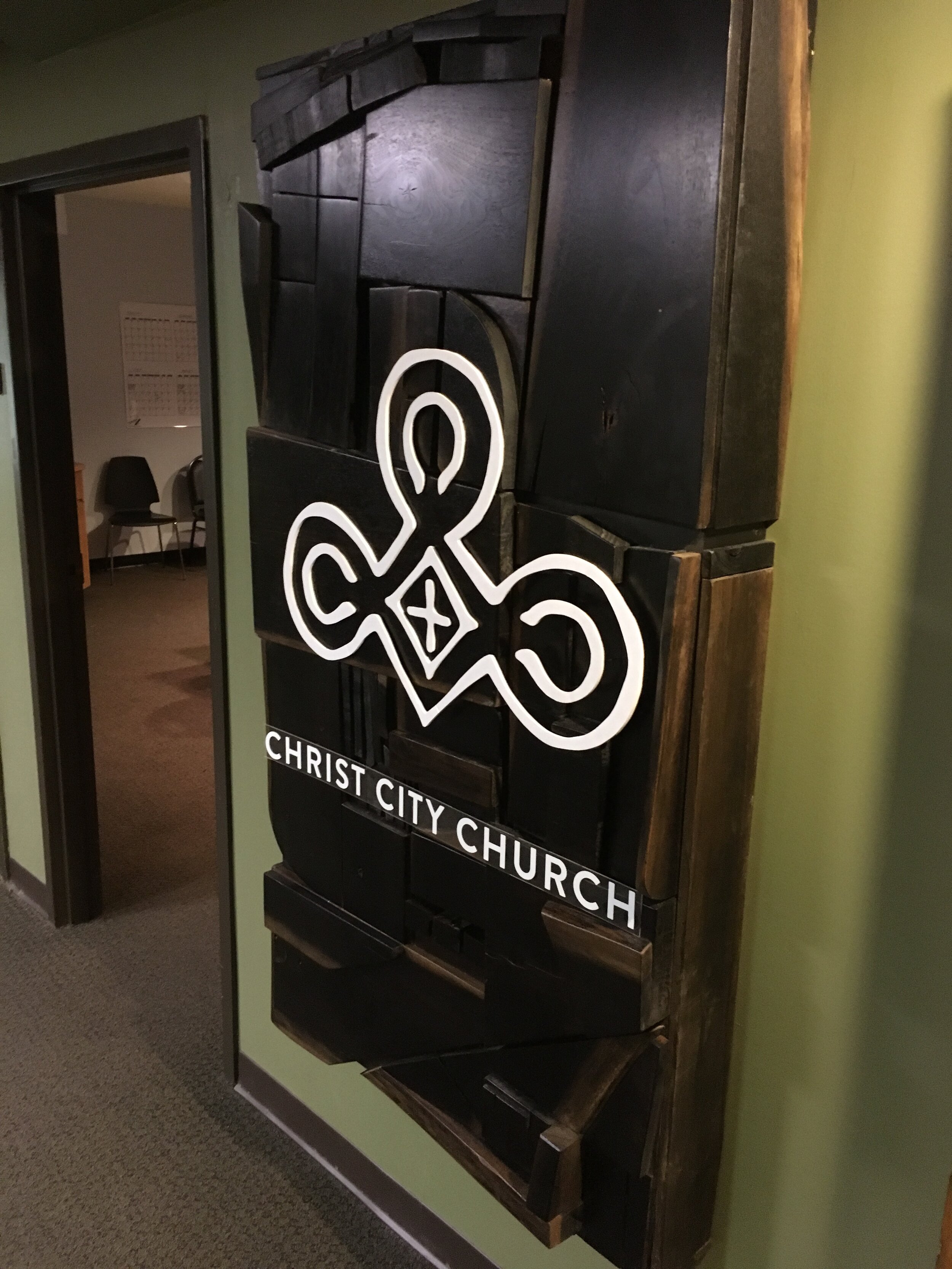
Awhile back, I was commissioned to create a sign for Christ City Church’s home offices. They had recently moved to the Playhouse building in Midtown Memphis . This, along with Christ City’s commitment to the area of Midtown, helped shape the direction the sign would go.

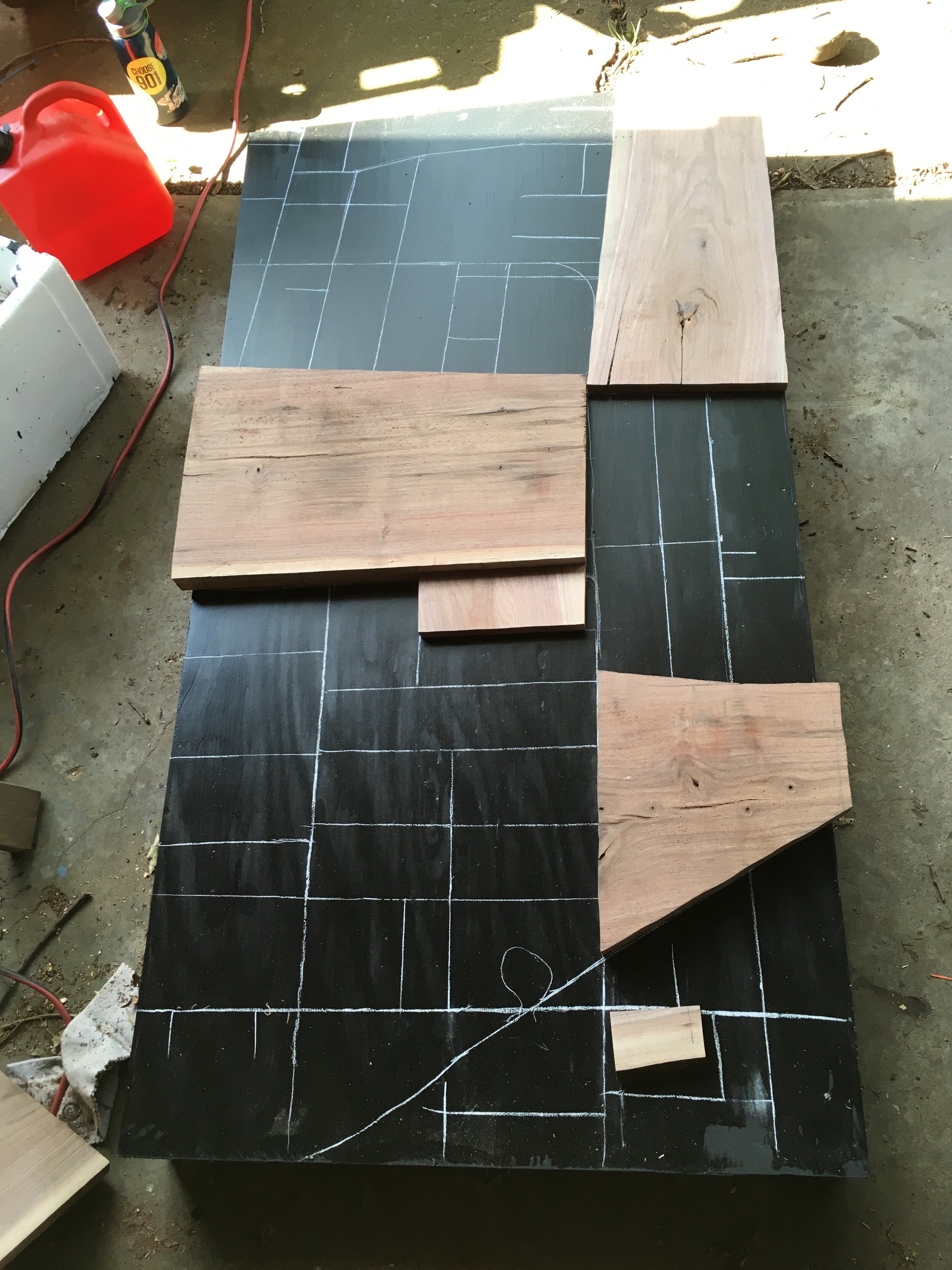
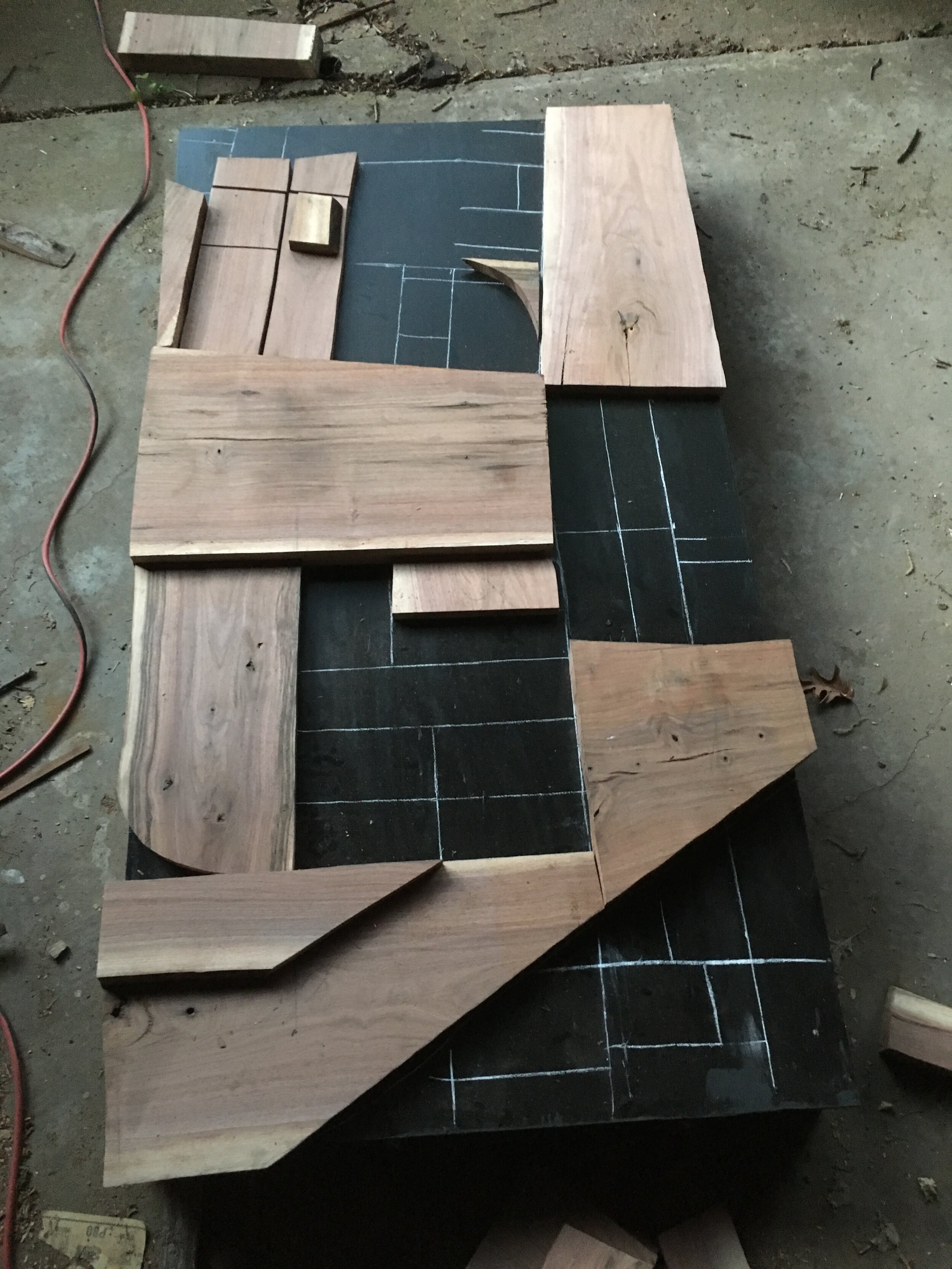
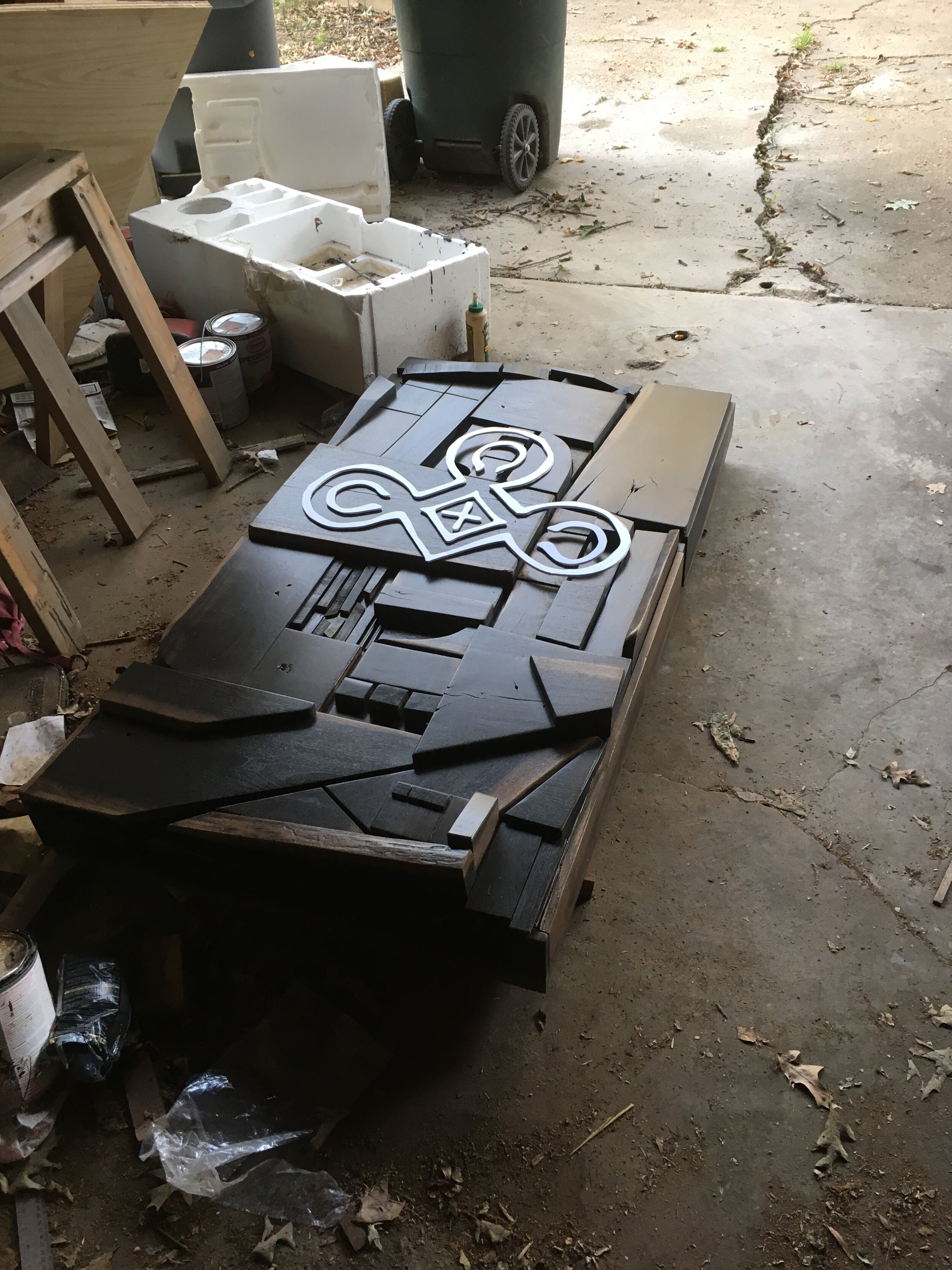
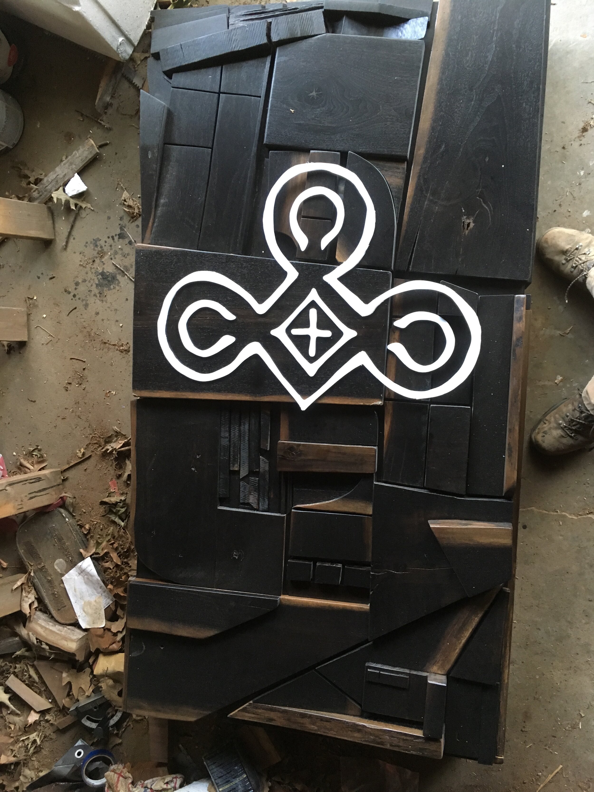
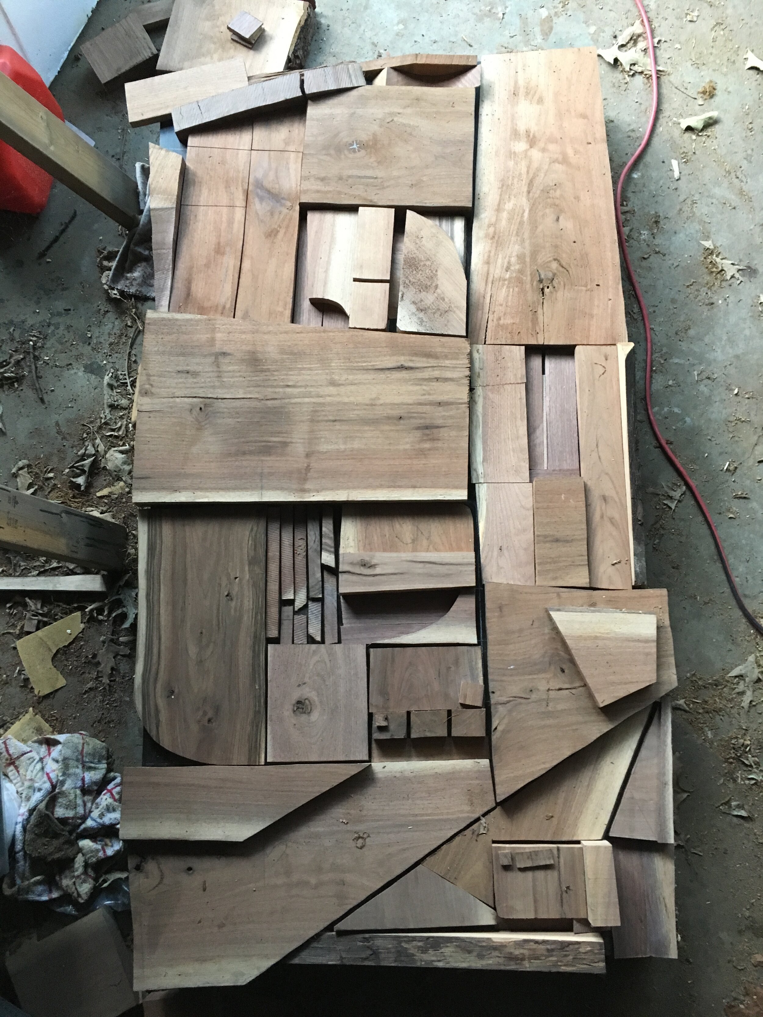
I’m a sculptor, so I will take any excuse to make something three dimensional. I cut and sanded scrap pieces of walnut to fit within a configuration that was based on the aerial view of Midtown. I started by drawing the map onto the substrate I built from basic plywood and 2x4s. I then cut and placed the pieces, giving care to visual weight and texture contrasts.

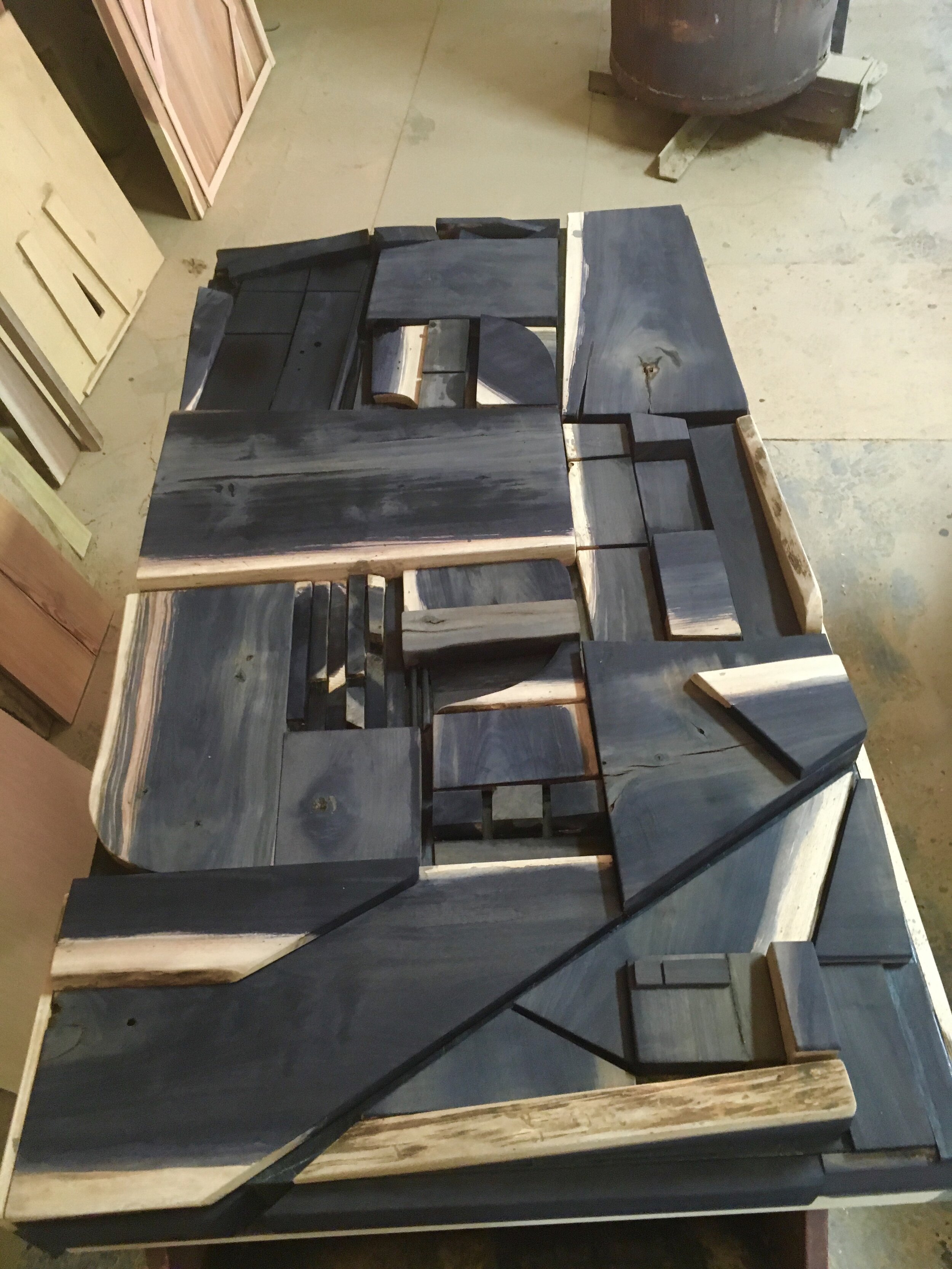
In terms of emotion, I wanted there to be a sense of coolness (as in cold) but strength. Think Stonehenge surrounded by fog. I am also perpetually inspired by Louise Nevelson’s treatment of texture by washing over her pieces with all black or white. The walnut I had brought too much color variation, so I decided to use an ebonizing solution (vinegar and dissolved steel wool) as a light stain to mute it slightly.

It blacked it out completely. This was unexpected, but if you didn’t know, the metal reacts to the tannins in the wood. White oak turns almost blue, but pine does almost nothing. Walnut apparently has a lot of tannins. So I rolled with that and went with a more Nevelson vibe.

After a fancy polyurethane finish afforded to me by my employer at the time (Woodland Tree Service), I got to work on applying the verbiage. The logo was already created, so I transposed that onto foamcore, where I then cut it out. This took much longer than I expected. After attaching the logo to the work, I hung it in the space.

In hindsight, I had a different image in my head of what the actual space was. I think I expected more natural light (the Stonehenge thing again), so upon arrival, I immediately noticed that in a dimly, warmly lit space, this thing is giant and dark and heavy. Maybe even intimidating. I might’ve made some different color decisions if I had to do it again, but ultimately, I think the light of the logo snapping sharply off the soft blackness is something that resembles Christ City in a way. I am proud to be in a church body that values having a huge brooding art piece as it’s first impression. It’s not afraid of beauty or of heaviness.

DePriest Standing Desk

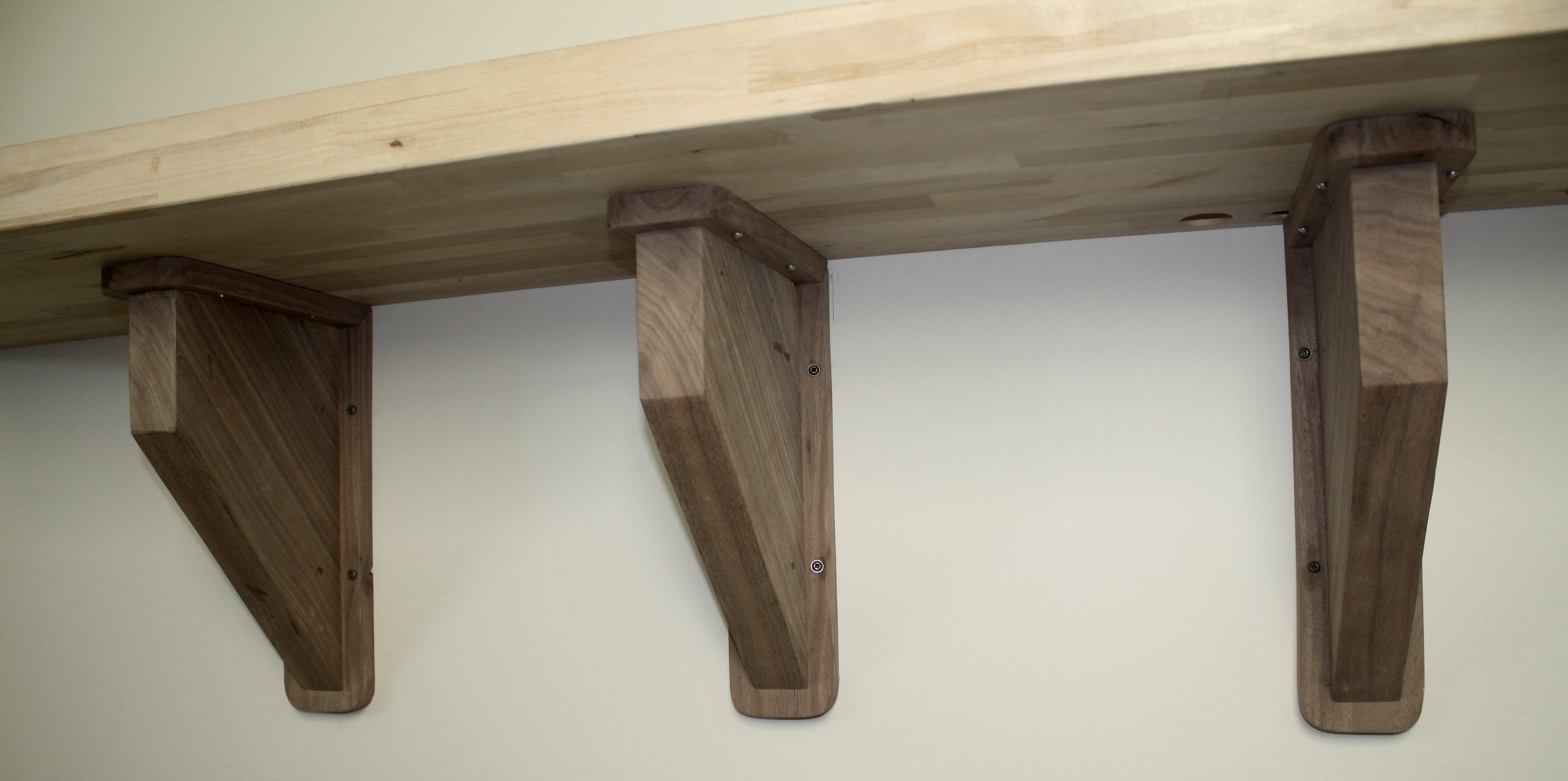
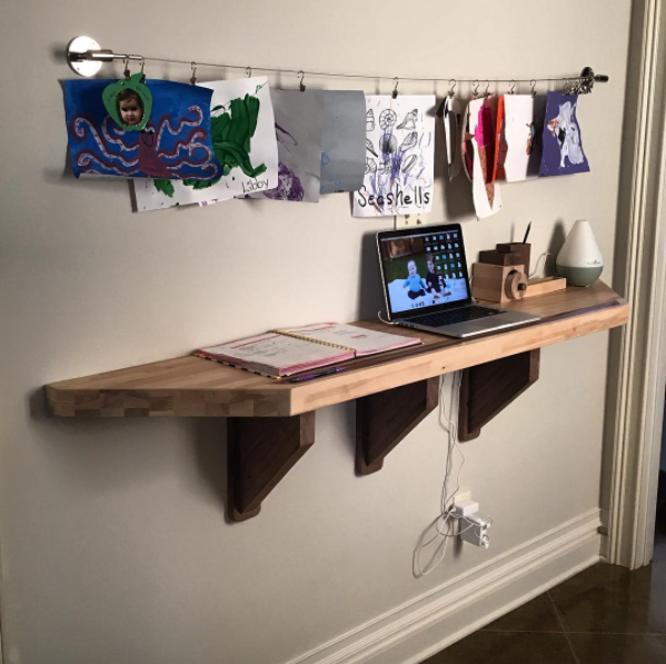
The commission was to make a space for the DePriest's to put all of their random stuff on. So utility is number one. However, I know that they love the clean, simple look that seems to give you not only physical space, but mental space as well. For …

The commission was to make a space for the DePriest's to put all of their random stuff on. So utility is number one. However, I know that they love the clean, simple look that seems to give you not only physical space, but mental space as well. For the desk to function properly, it needed attention given to how it looked. Thus, the utility demands poetry.  

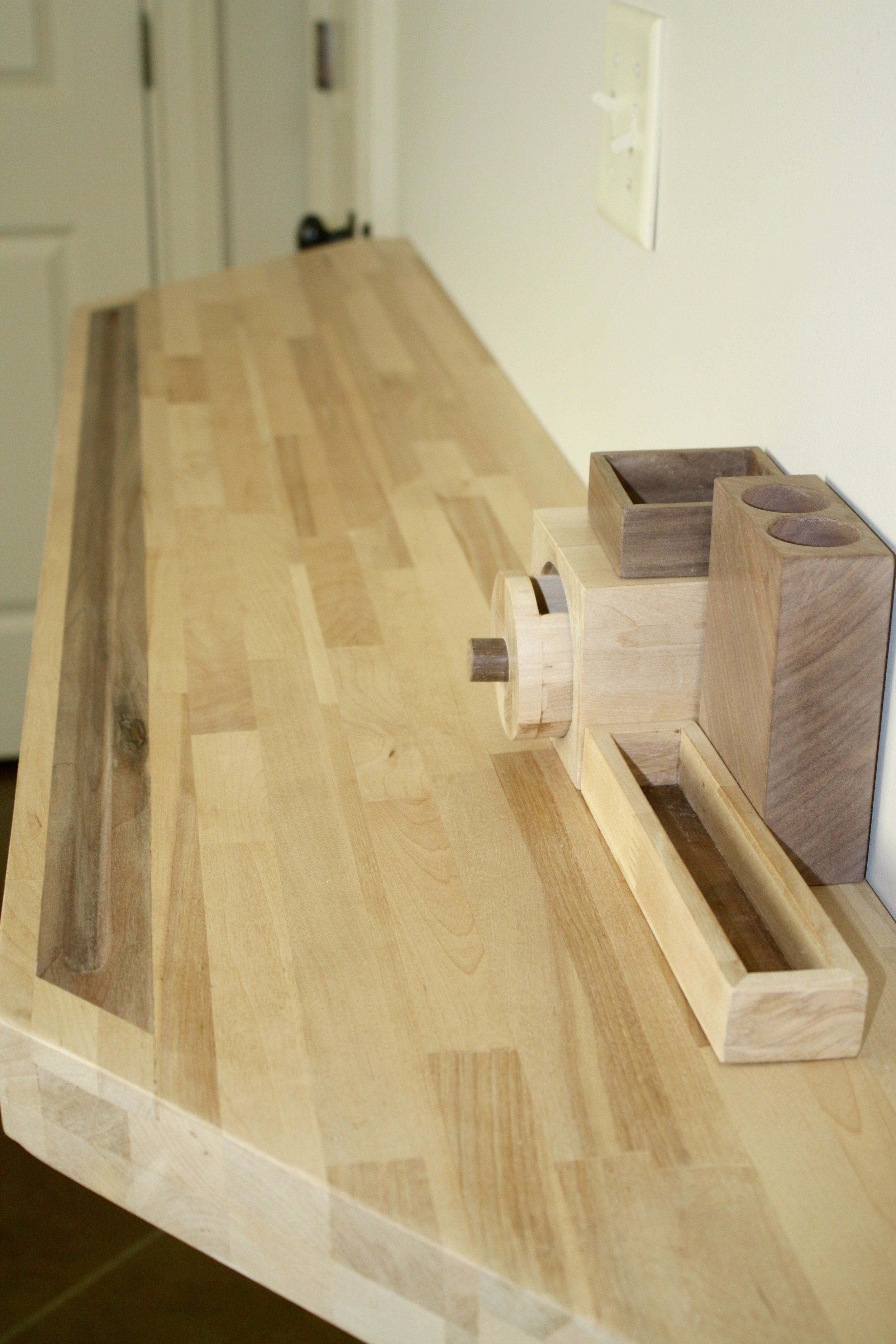
The wood is actually an interesting story. We wanted the butcher block look, so we got what looked like laminated pine. But upon further inspection, it wasn't pine at all. Rather (my boss, Joe, says) it is the remnants of a used up rubber tree. It's…

The wood is actually an interesting story. We wanted the butcher block look, so we got what looked like laminated pine. But upon further inspection, it wasn't pine at all. Rather (my boss, Joe, says) it is the remnants of a used up rubber tree. It's cheap and durable enough for a variety of uses in commercial, mass production wood furniture. Looks good enough to me.

I added an inlaid walnut strip with a pencil holding groove. The finish is good ole paste wax.

I figured it would be helpful to have pencil, paperclip, and random stuff holders, so I couldn't resist making a bandsaw box. In order to keep the utility, but also show that the desk and pieces were all one entity, I made little notches for each bo…

I figured it would be helpful to have pencil, paperclip, and random stuff holders, so I couldn't resist making a bandsaw box. In order to keep the utility, but also show that the desk and pieces were all one entity, I made little notches for each box to fit onto. They can be moved or stacked into any configuration. Or if the DePriests decide to take them away, the notches can be sunk flush with the surface of the desk.

These are holes for wires to easily access electronics on the desk without having to go around and over the whole thing. The hole on the right is for a typical Mac charger, so that when you slide it through, you can put the collar on so that it does…

These are holes for wires to easily access electronics on the desk without having to go around and over the whole thing. The hole on the right is for a typical Mac charger, so that when you slide it through, you can put the collar on so that it doesn't fall back down the hole.

The supports wound up being the most surprising part of the whole project. I figured they would be almost invisible. I was very wrong. In fact, they almost overshadow the desk itself! Not only were they large, but my lack of knowledge and skills nec…

The supports wound up being the most surprising part of the whole project. I figured they would be almost invisible. I was very wrong. In fact, they almost overshadow the desk itself! Not only were they large, but my lack of knowledge and skills necessitated putting the trim around the outside. This created a more traditional, classic look that deviates from the rest of the piece. In all though I still enjoy its look of strength.

Golden Garden Bench

Last week, I was invited to make some benches for the brand new and beautiful Golden Garden at Melrose High School in Orange Mound. Under leader Kevin Mattice (@kjmonopoly), the math teacher there and friend of mine, organized Home Depot, Memphis Teacher Residency funds, Red Zone Memphis, Dabney Nursery, the football team, and myself to create the space of beauty and ease for the school. I am overjoyed to be permanently part of such a cool endeavor.

Here's how I did my part...

Rolling off this furniture kick I'm on, I leapt at the chance to make some benches for Kevin. We knew they needed to be water-resistant, sturdy, and pretty. For water-resistant, I chose Western Red Cedar, whose properties are naturally so, while planning to add a coat of waterseal on top. Sturdy and pretty came together out of much research. We decided to tweak a design called the "Palisade Bench" by landscapeforms to make it more cost effective and a little more personal.

Once the date was given, I set off to grab the lumber and begin assembling.

There wasn't really that much thinking to do other than making sure everything was neat and square. It kind of built itself.

Much glue was used, but it was reinforced by a.) screws tying each modular section (leg-bar-leg) together and b.) a threaded rod tightened in each corner for extra security. 

IMG_2544.JPG

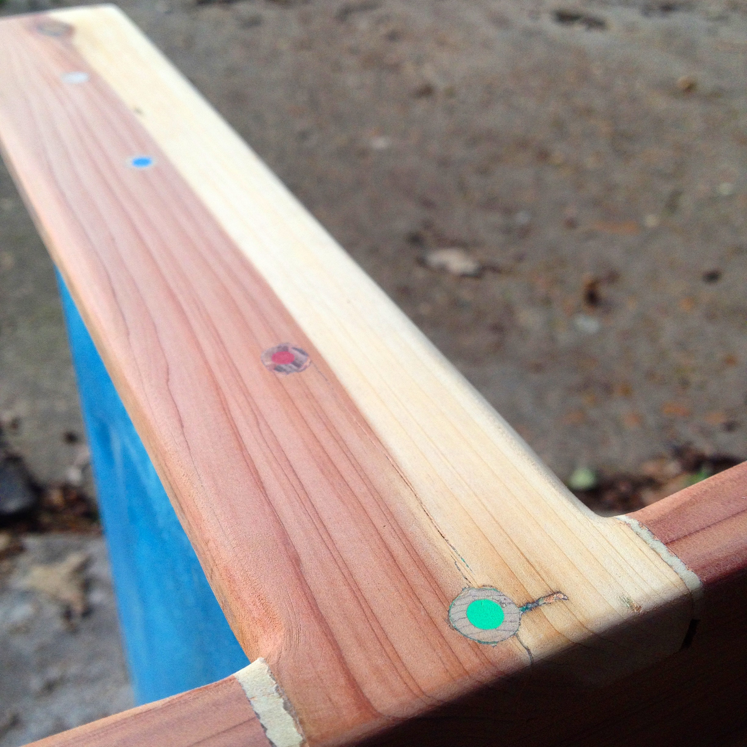
The threaded rod wound up sticking out a lot (which shows you my measuring skills) so I decided to alter the original plan to cap the rods with wooden dowels and saw it flush. The rod would still show. So I capped around it. I drilled a hole into the dowel for the rod to rest in as the cap was hammered into the beam. Then it stuck out proud which gave some character to the otherwise sterile look. 

IMG_2547.JPG

After an added flower box niche in the second bench, I used Thompson WaterSeal to coat it. It looked pink at first but settled into a nice warm amber.

The final product in its proper home. Yes, those trees, boulders, rocks, flowers, and mulch were moved in. I had the easy job.

Garden photos by Kevin Mattice.

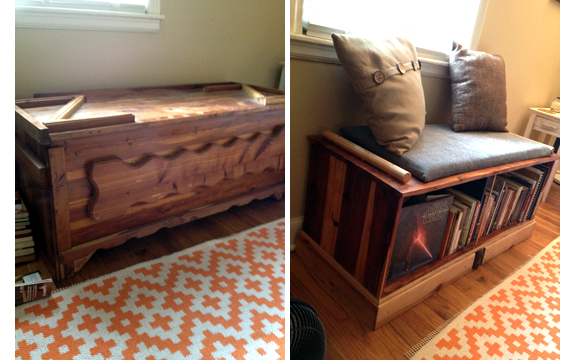
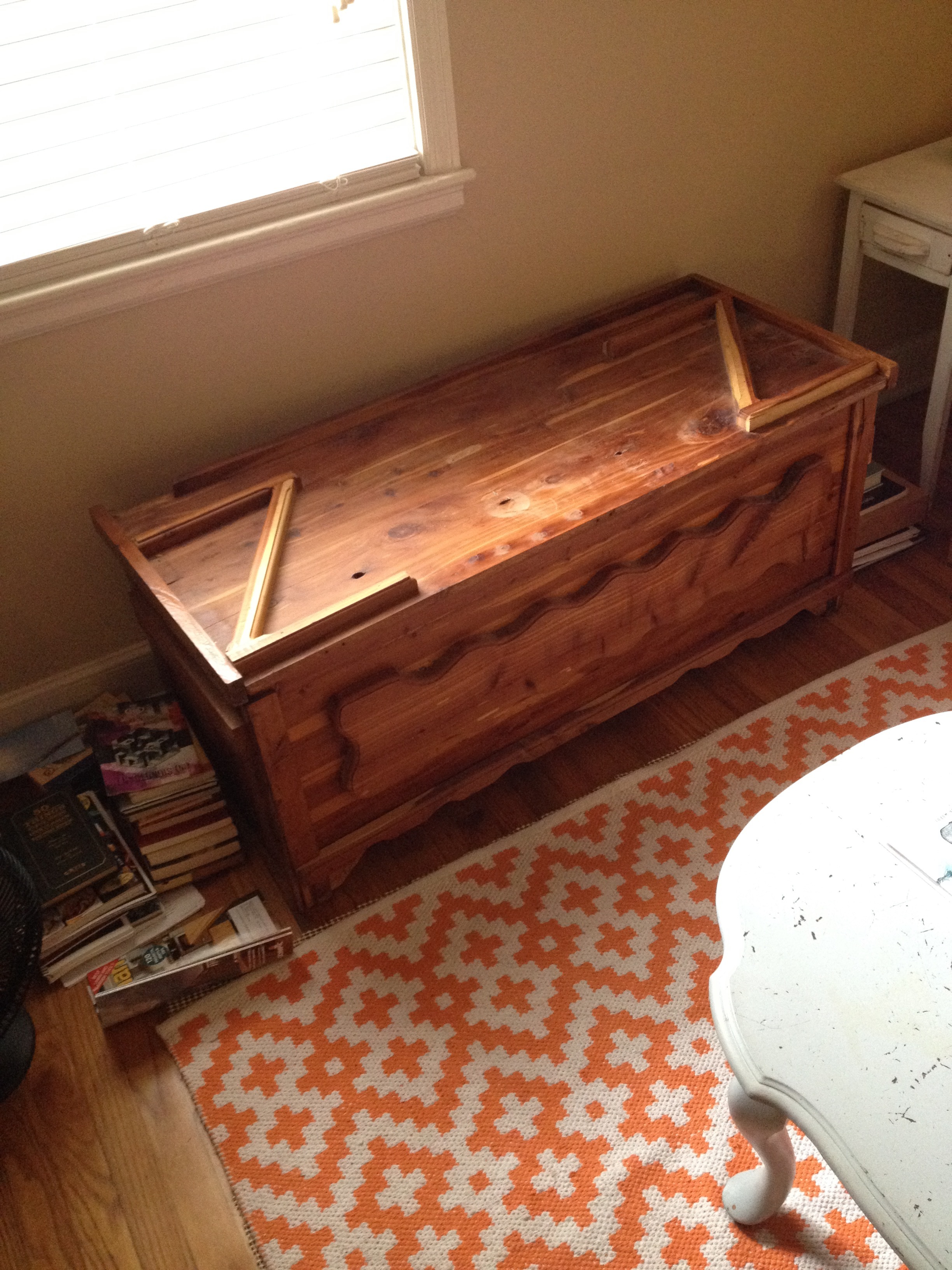
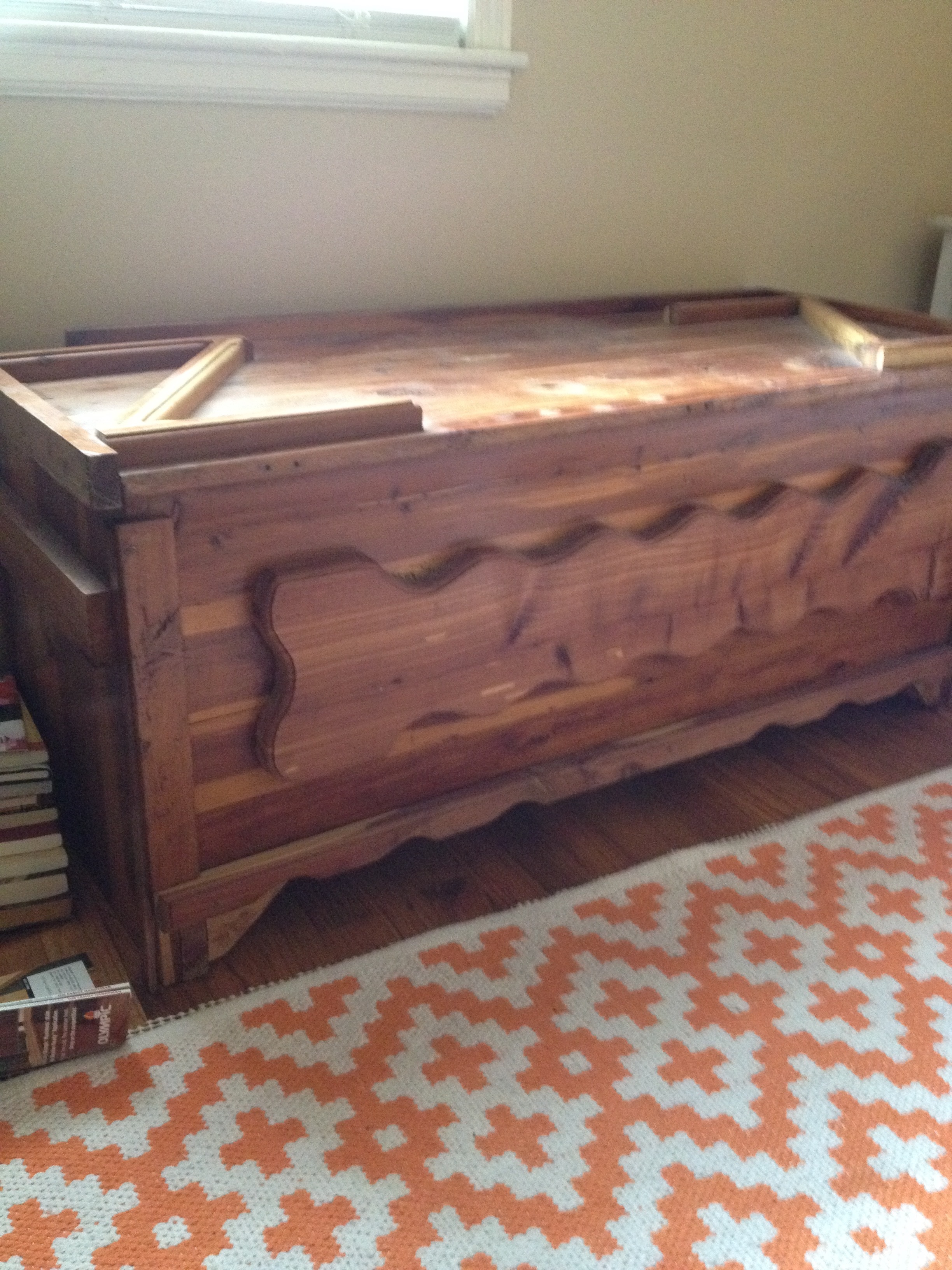
Book Bench Refab

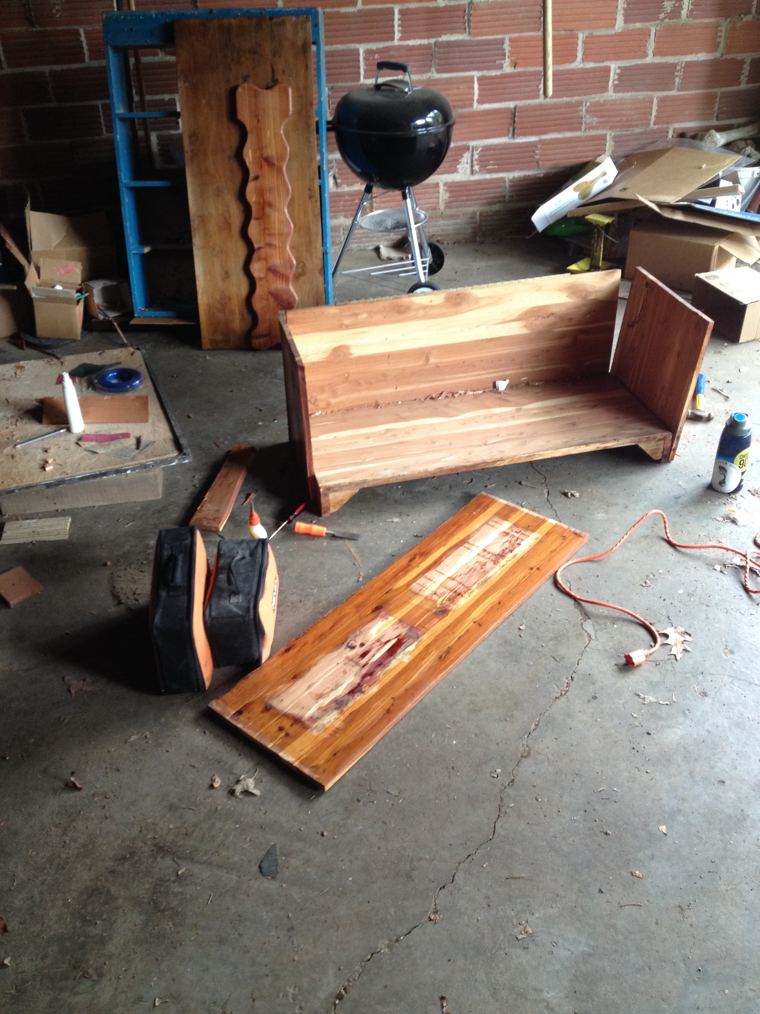
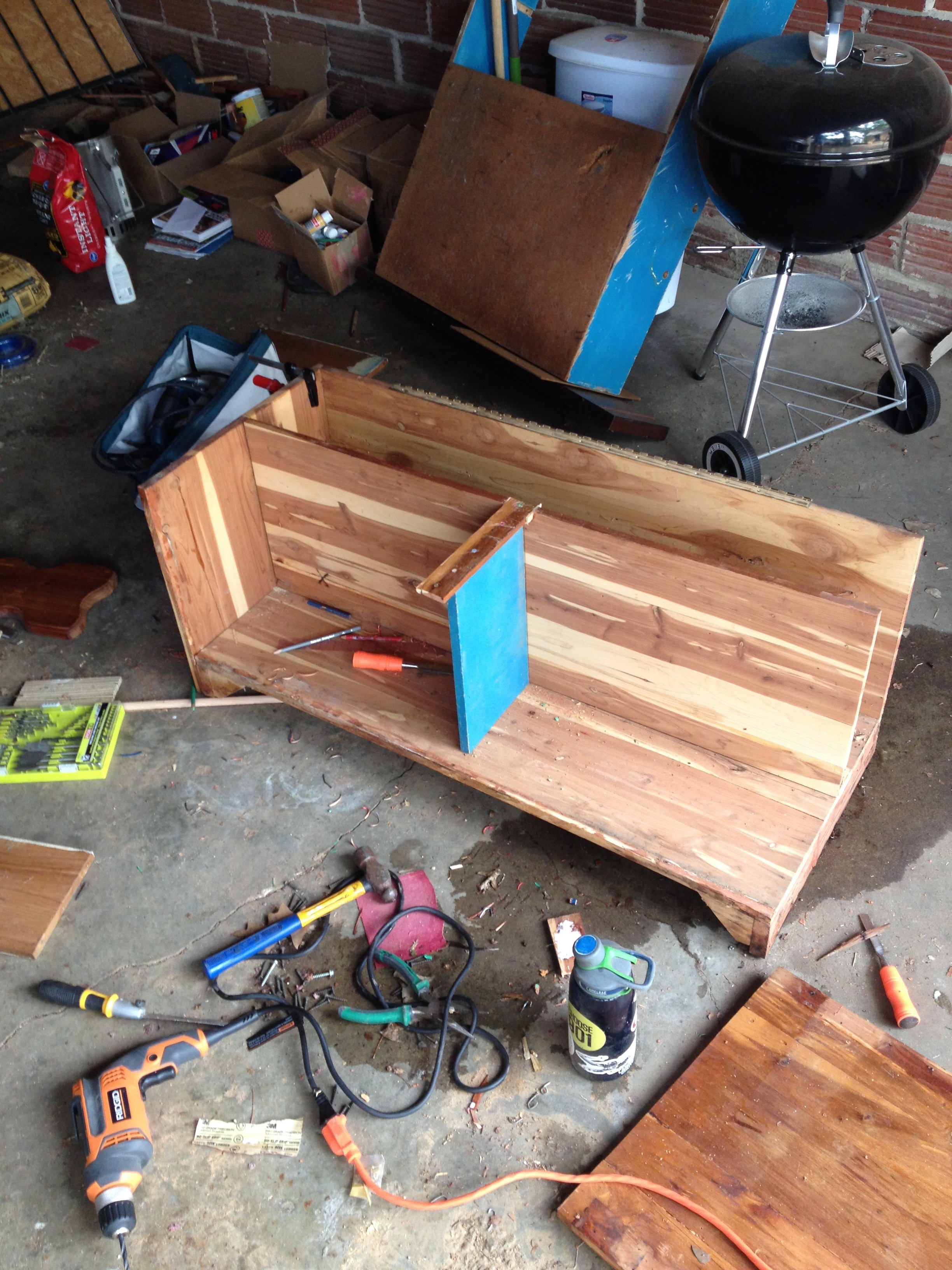
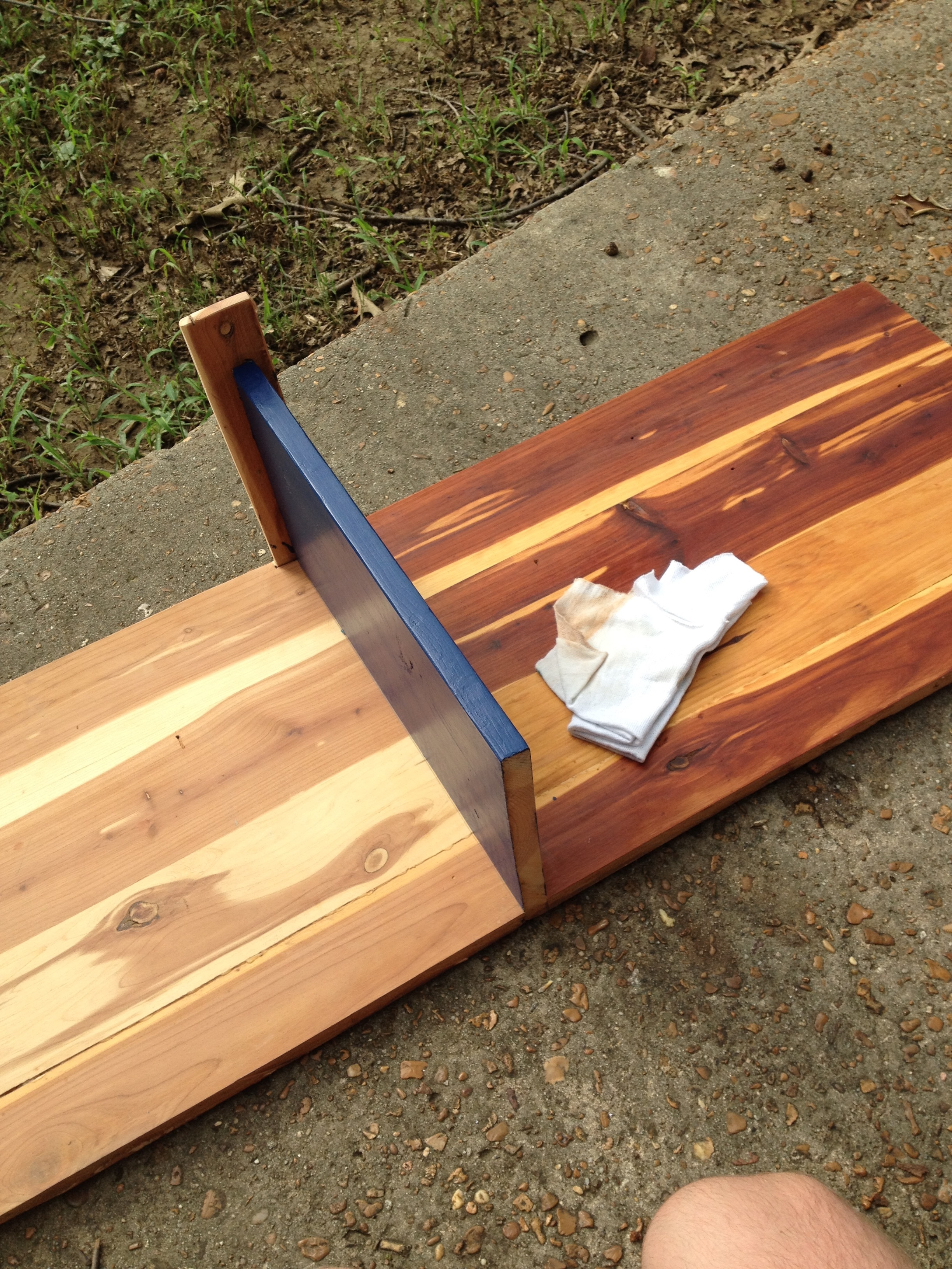
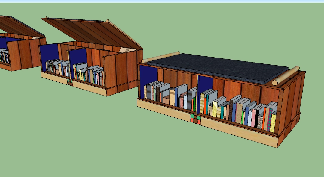
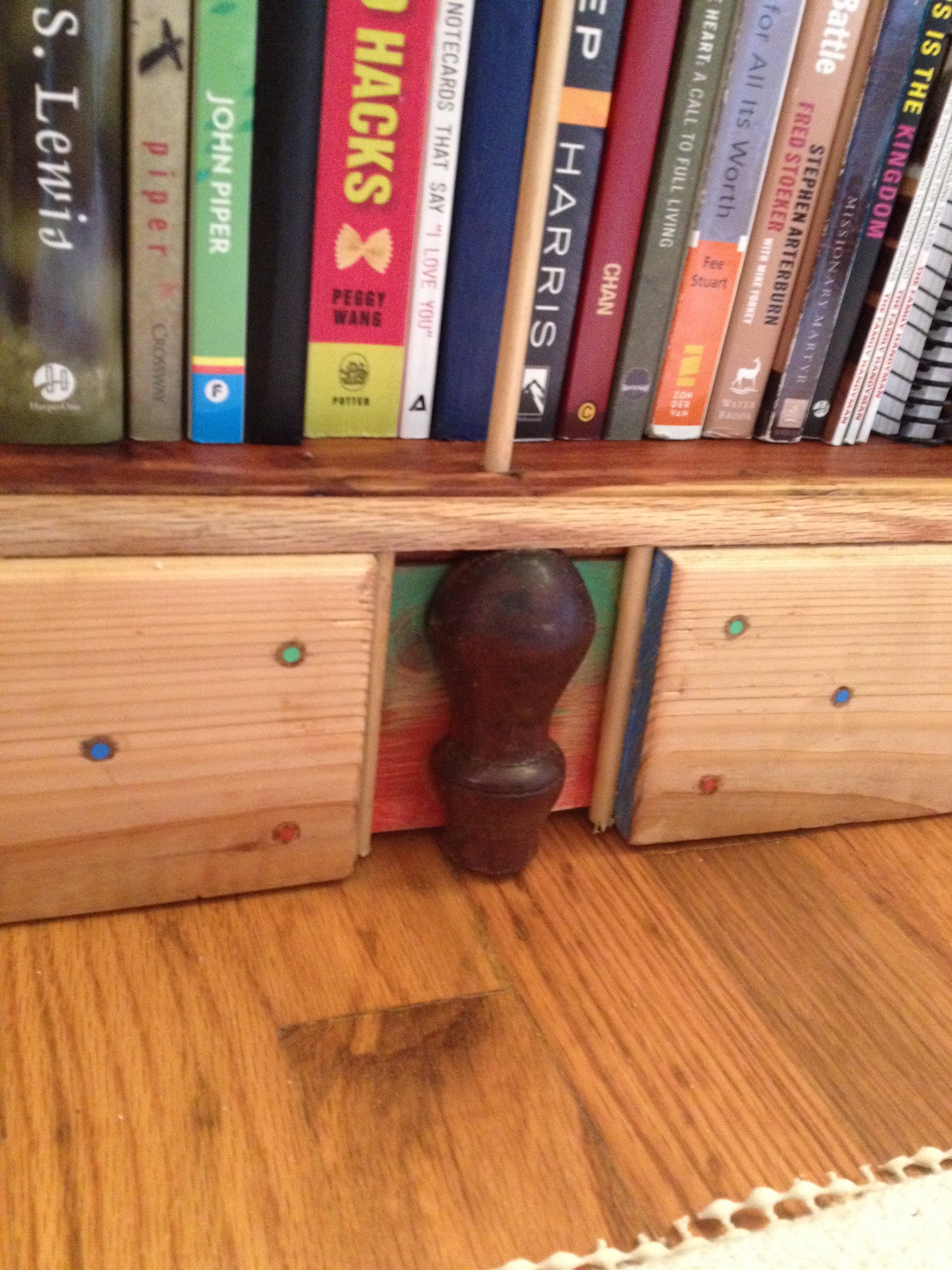
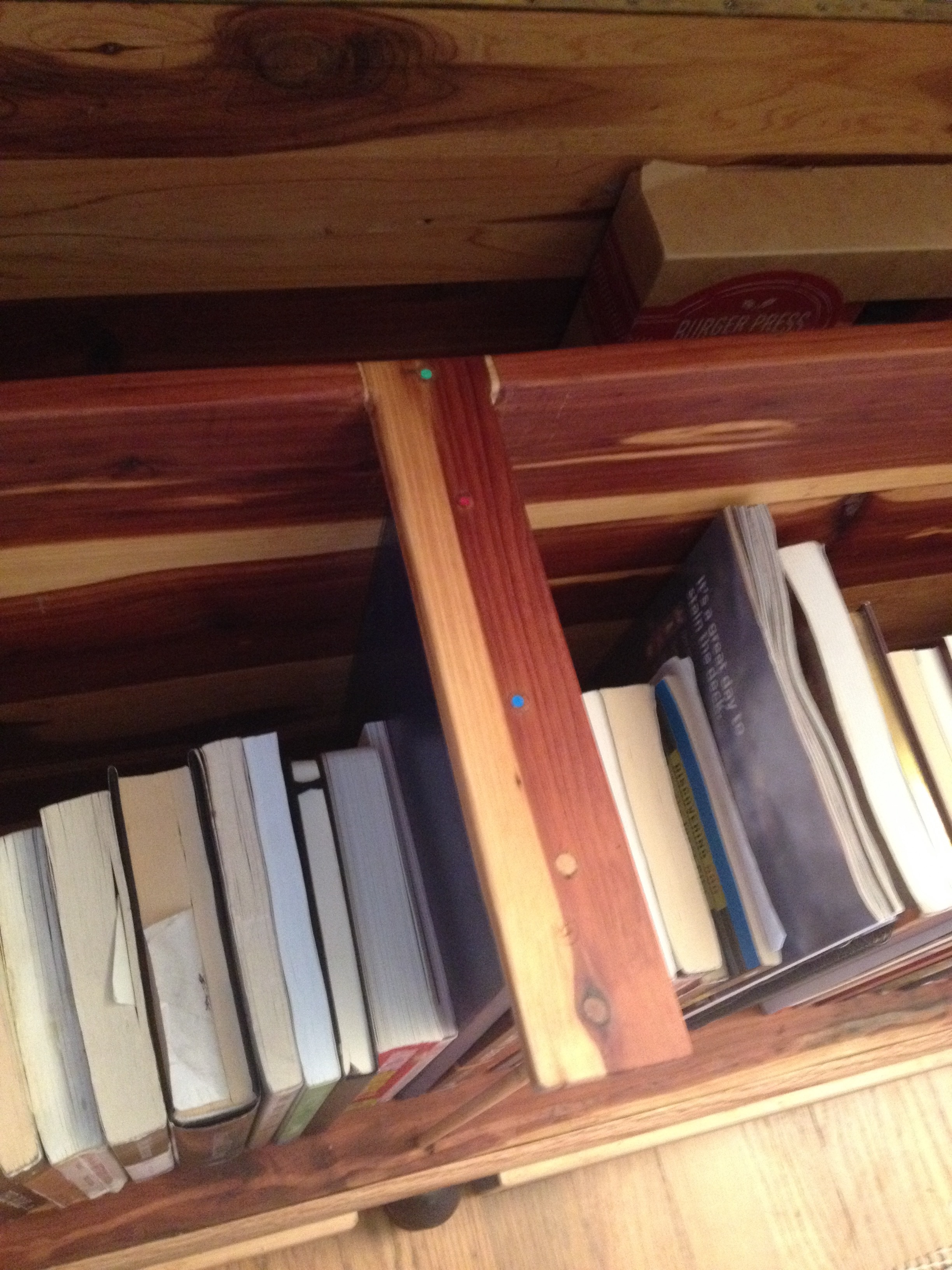
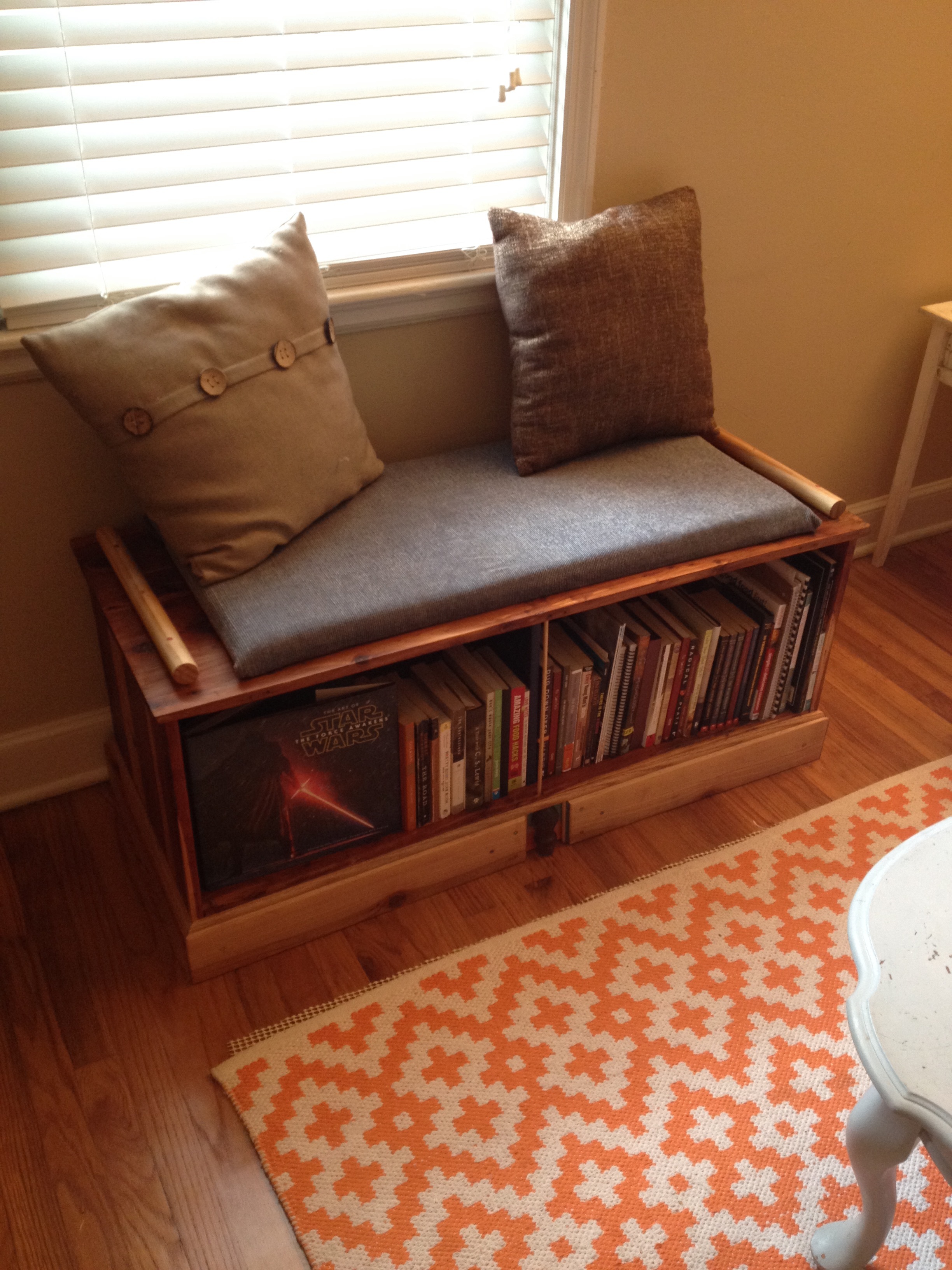
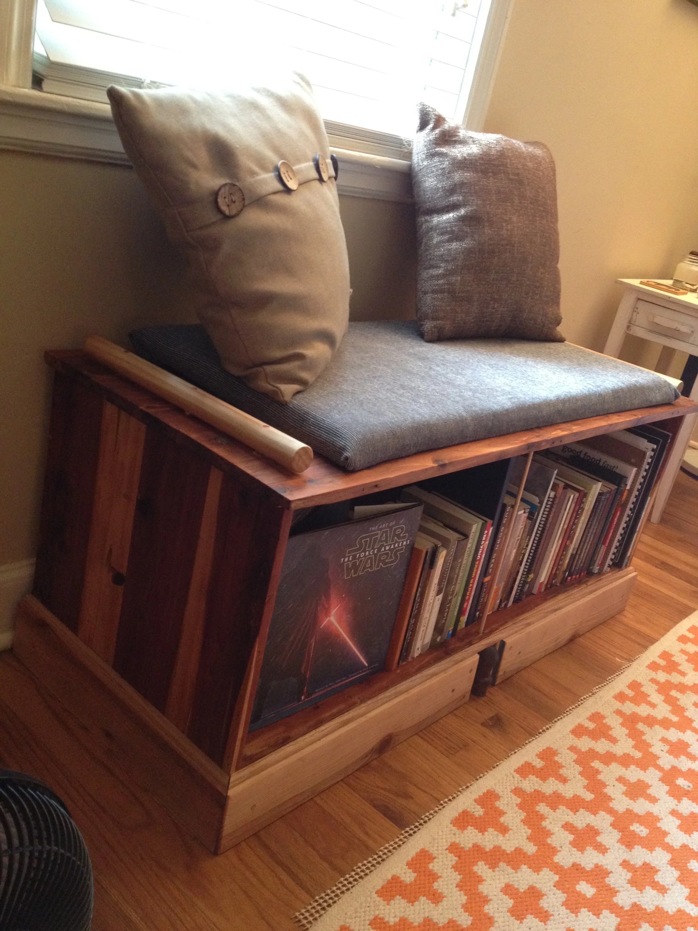
Using minimal outside materials, this creaky, uncomfortable chest was turned into a sturdy, multi-purpose piece worth displaying. Watch how it was made, along with viewing the atrocity that is the shop cleanliness.

Oceans and Mountains

In the beginning, there was no art. There was God and the nature He built and all of the beauty that it, by being created by the source of all good, inherently holds. Nature was pretty because God is. 

I grew up going to the Gulf of Mexico, seeing blue-green water and sugar sands, however, I recently visited the Rocky Mountains. It sounds cliche, but I was immediately struck, and am still struck by their beauty. "Of course, Ben! Get with it, that's why people spend millions on vacations to go there!" But the advantage of seeing the mountains at an older age is that I got to understand how similar they are with the ocean. Why do people spend collective billions on a chance to just sit and stare at the geological anomalies? I would put forward it is because they are rich, multilayered pieces of art both visually and conceptually. They are captivating, having the same characteristics as the One who created them.

mountains.jpg

 If only looking at their outward appearances, they are utterly opposite. The ocean is flat and the mountains are tall. They occupy either extreme. On the shore, an ocean is flat as far as you can see; motionless up to the curve of the horizon. Yet it is constantly gurgling and crashing and circulating without end. The ocean rests perfectly where our vision naturally settles, while asking us to enjoy our two-eyed, widescreen format while gazing. On the other hand, the mountains seem erratic, vertically jumping and spiking as evidence to the massive amounts of energy released in order to create them. Yet they are hauntingly still. You hear nothing; there is just vast grey weight shooting sunward so that you see the ground when you look up. 

All that is before you even stop to think about what mountains and oceans do. Like the Lord, both could kill you without mercy and without notice. If you get lost in them, you could never be found. Their movements shape the face of the planet. But, again with an opposite, they are brimming with life. They are, in fact, the reason there is still natural life on Earth. They are swift in power, yet overflowing with life and beauty.

These earthly structures show that opposites create captivation, and that these are characteristics of our Lord. We draw near to these works, but with utmost fear and care. Like our own art, the creations draw attention to the one who made them. 

The Discipline of Beauty

During the frantic endeavor of trying to make a perfect composition for the outdoor sculpture, I slowly became troubled. The more and more I worked, it seemed, the worse and worse my ideas became. I had a general idea of what I wanted to do, but even it wasn't as fulfilling or exciting as I had been hoping. For several weeks I have been learning new skills, which is great obviously, but I think I made the mistake of relying on skill acquisition to be in itself my perception of good creation. Essentially, I became so worried about how to weld, cut, grind, balance, and every other non-intuitive thing you can do to metal that I forgot how to make things look beautiful. And not just having a pretty weld.
I realized this when, through a friend, I came across the work of Andrew Hayes.

Bold, beautiful lines of steel combine with the lilting pages to create simple, yet totally profound, visual statements. The steel is the flimsy pages' antithesis, warping itself around the other. There is nuance and subtlety, yet almost a violent contortion of the book that becomes essentially another medium. All without anyone paying attention to the impeccable forging and welding it took for the viewer to even see these things clearly.

EH-HEM.. Pardon the drool..

It was my response to this work that was most intriguing. To be honest, this work isn't even earth-shatteringly contemplative, it's just darn pretty. I feel like I recognized beauty in a sculpture for the first time in a long time without thinking about how it was made. This drove me to look at other work, not for it's techniques, but for it's aesthetics.

So I went and found 30 artists to observe. I needed more examples of beauty; to fill up my visual tank, if you will. It was very similar to reading the Word. Sometimes you get excited about God, so you read the Bible, and sometimes you know you aren't relating with God in the way He intended, so you read. I would never call art God, but this process showed me the value of spiritual discipline. I couldn't pour out without being poured into. I thank God He's used work to sanctify me in that way.
Display & Surrender II

I have made the argument before that sometimes the visual of an action holds more value than its monetary worth. Here is yet another example...

In 1989, Kenyan President Moi acquired some 12 tons of illegally poached elephant tusks from his predecessors. Of course wanting to end the trade, he was advised to sell off the ivory and make $3 million to fight poaching. Nope. He had all of it stacked in a huge mound and burned. News media covered it and people paid attention. It set off a barrage of other nations to light their own elephant pyres and set a ban on the trade of ivory in Kenya. Had he sold it all and spent the money to buy new equipment and staff, there wouldn't have been the loud resolve that the burning had. The resolve was worth more than the money.


For extra info, go to RadioLab's podcast "The Rhino Hunter"

Display & Surrender

I like to think about doing art as a sacrificial act. Mark 14 describes a scandalous moment between Jesus and a local prostitute (also Matt. 27 and Luke 7). She enters where Jesus and the disciples are breaking bread only to break an alabaster jar and start rubbing the perfume inside onto Jesus’ feet with her hair. Clearly this clingy woman of the night has no boundaries or even common sense. People there recoil at the amount of money it could have been sold for to give to the poor. It seems senseless.

However the vase wasn't just expensive; it represented the woman’s entire life and livelihood. Families kept vases like these almost as a status symbol, costing an upward of a years wages. This jar was an heirloom of sorts. This one she had turned into the toolbox of her trade. So after reading this scene we see that she wasn't wasting, but rather symbolically laying out her life onto Jesus’ feet. It had no practical purpose. No money was gained, no sustenance had, but the woman was now liberated and Christ was now exalted. She not only had shown a physical symbolic representation of an inward spiritual reality (like Baptism for example), but her symbolic sacrifice was also material sacrifice. It crossed over into real cost. In the end Jesus rebuked the party's rebuke, saying, “Leave her alone... Why are you bothering her? She has done a beautiful thing to me...” When appropriate, a simple display of beauty can bring much glory to God. This display was destroying an idol.

Worship in music does this. When I worship corporately, I am not the first one to physically show how I feel. I want to dance or sing super loudly, but because of my idolatry of other people's opinions, I refrain. In that situation if I danced and sang and clapped where other people weren't, I would not only be showing a physical manifestation of an inward joy, but I would also be letting go of an idol and grabbing hold of my dignity found in the Lord.

How would we do this in visual art? Initially, it's easy to see how we could use a manipulated object to point to an inward (or outward) reality. This is what art has done for ages. What does art do but point to itself or something elsewhere? However I can craft the most visually enrapturing, Gospel centered, audience loving sculpture, but if it only stays in a gallery, or further, only in my studio, then there is no Gospel in that work. The idol of self-preservation and pride is still there, Look at my thoughtfulness and skill. I would just be using the Gospel story in my work as bait to do that. I would be singing, but not worshiping. 

A crossover, mentioned before, has to happen where symbol of a reality again becomes reality. Humble Beast records creates Jesus exalting music. However, they give all of their music away for free under the moniker "Freely Given", devoted to radical generosity. The Gospel didn't stop at the end of a song; it continued in their entire business model. They are taking on the burden of finding funds elsewhere to be able to give us all their (amazing) albums. 

"Visual artists giving their work away for free? Hilarious." Maybe so, but the mindset is still correct. What about Jesus raising you from the depths of your sin makes you want to change how you work? It could be  an actual donation-type sacrifice like offering a percentage to Compassion International or International Justice Mission. Like with Humble Beast, the sacrifice relinquishes the idol of wealth while still imitating Christ's ultimate generosity. Another way is intentionally working within, say, the gallery scene with an explicit Christian message to redeem that part of culture. The idol dropped would be potentially fame or favoritism. You certainly wouldn't be picked for certain shows, but if the work is of quality, people can't ignore it or your witness. 

Somehow visual art  needs to transcend the artist and his or her own thoughts and skills. By loving the Lord, art is the medium for which not only His story is told, but also how it is displayed. Like the woman with the alabaster jar, the expression is just as important as the symbol. Surrendering idols make work all the more beautiful.