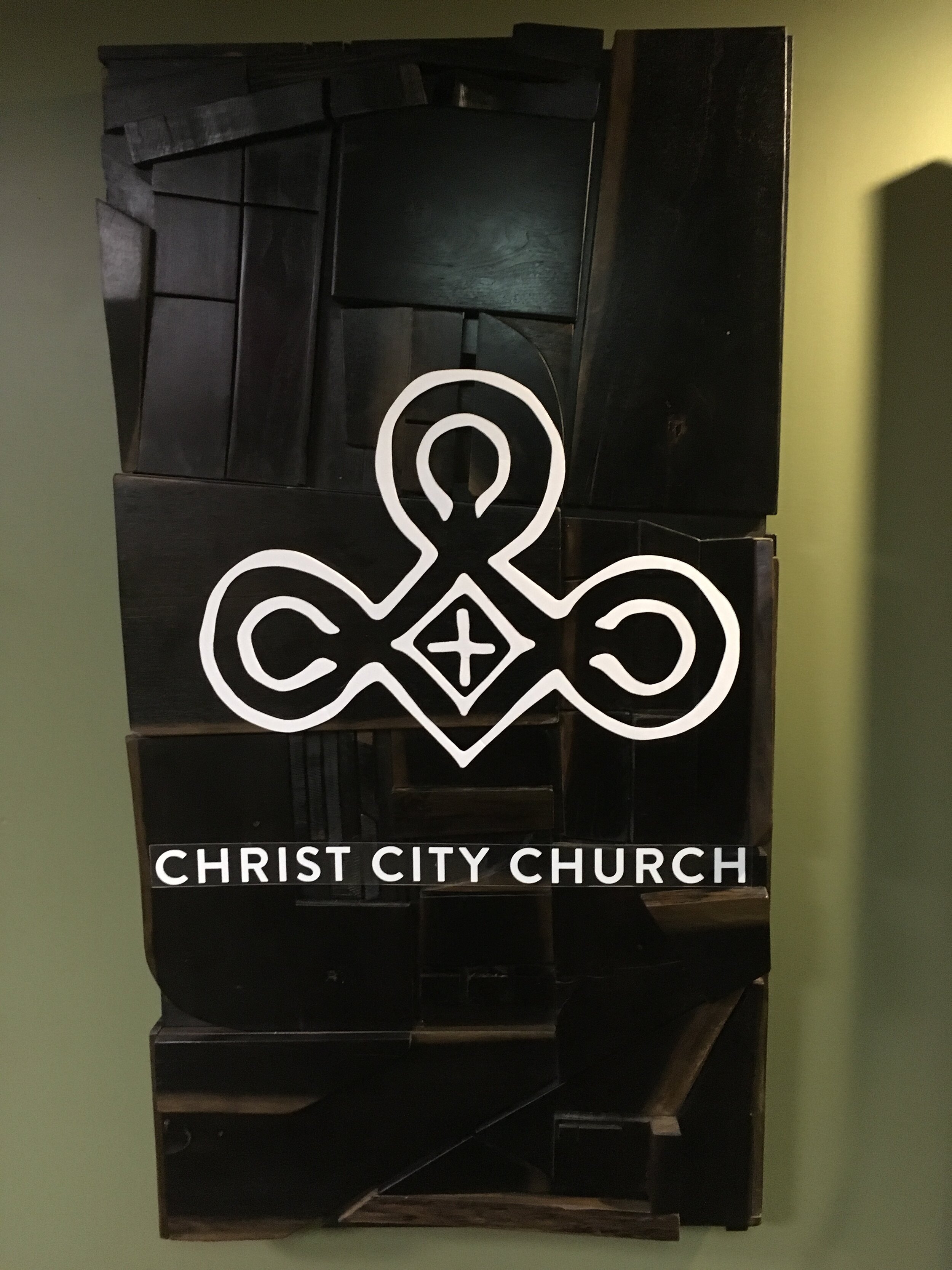
Awhile back, I was commissioned to create a sign for Christ City Church’s home offices. They had recently moved to the Playhouse building in Midtown Memphis . This, along with Christ City’s commitment to the area of Midtown, helped shape the direction the sign would go.
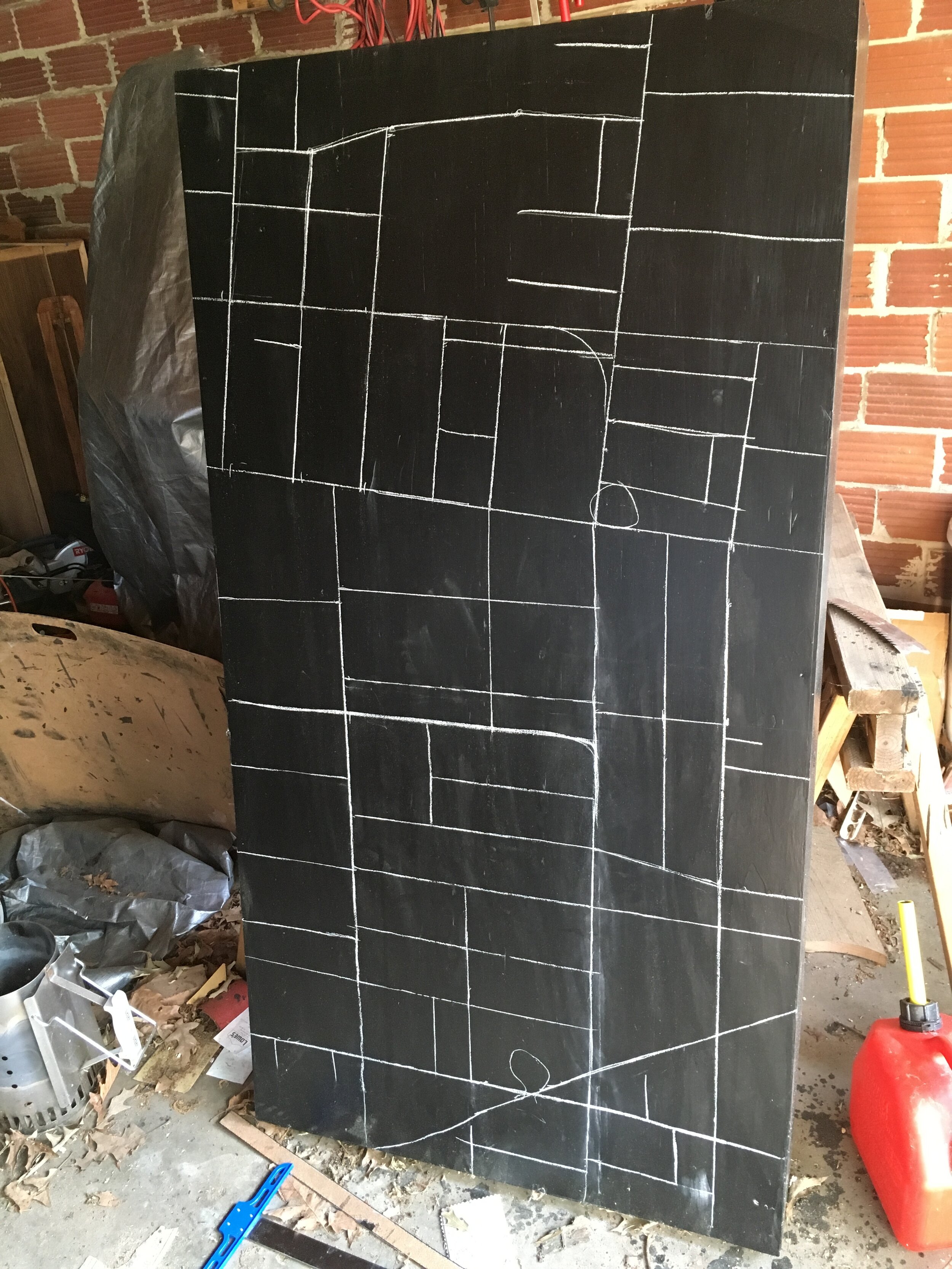
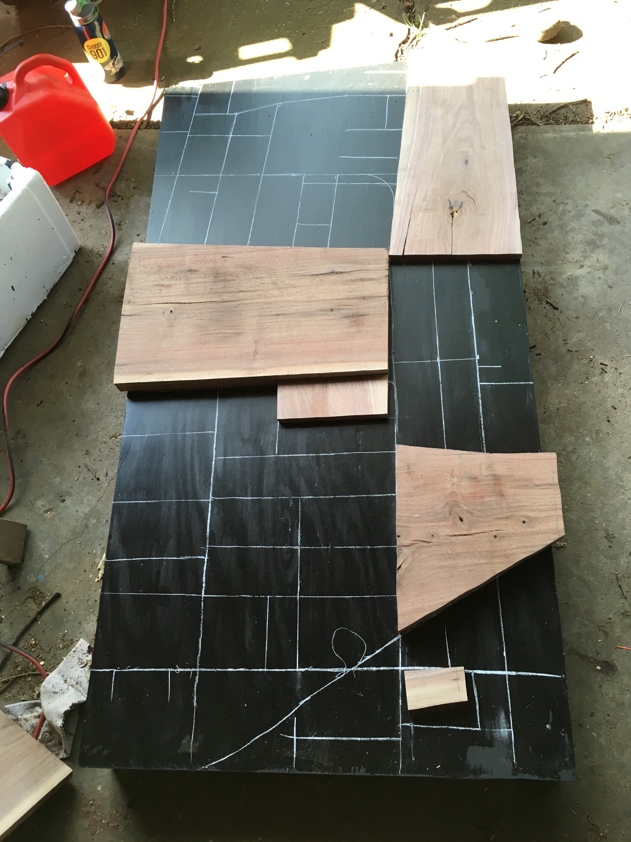
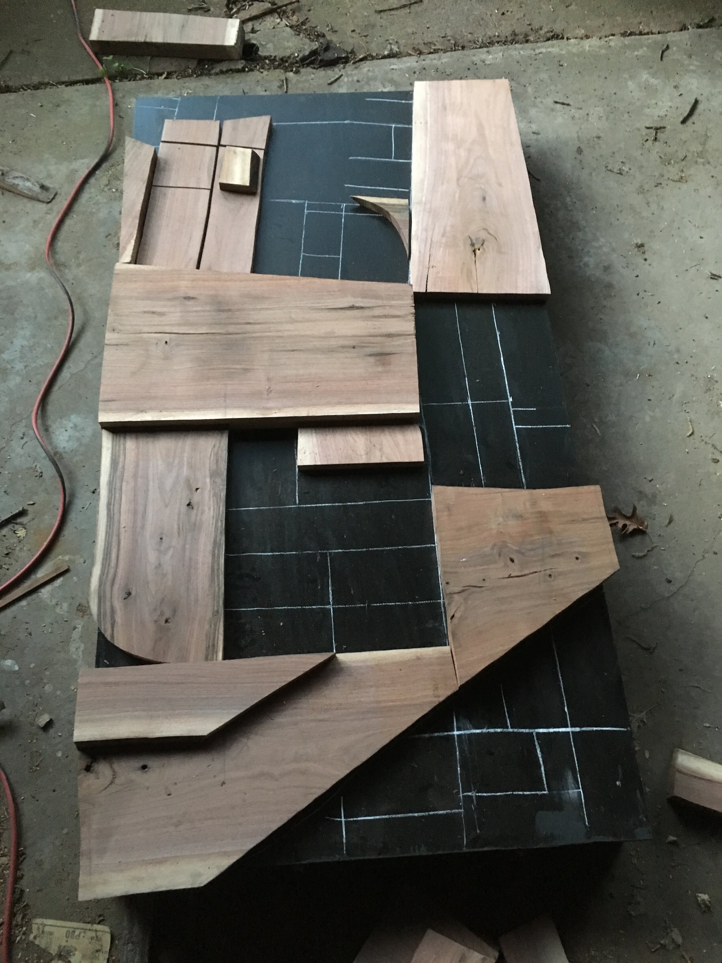
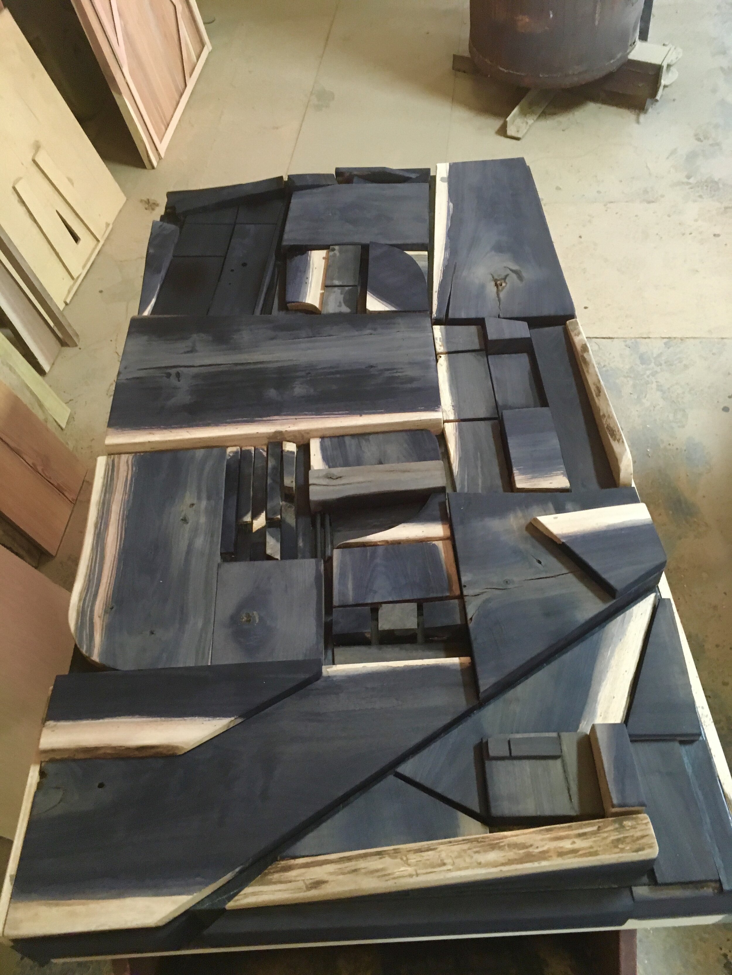
I’m a sculptor, so I will take any excuse to make something three dimensional. I cut and sanded scrap pieces of walnut to fit within a configuration that was based on the aerial view of Midtown. I started by drawing the map onto the substrate I built from basic plywood and 2x4s. I then cut and placed the pieces, giving care to visual weight and texture contrasts.
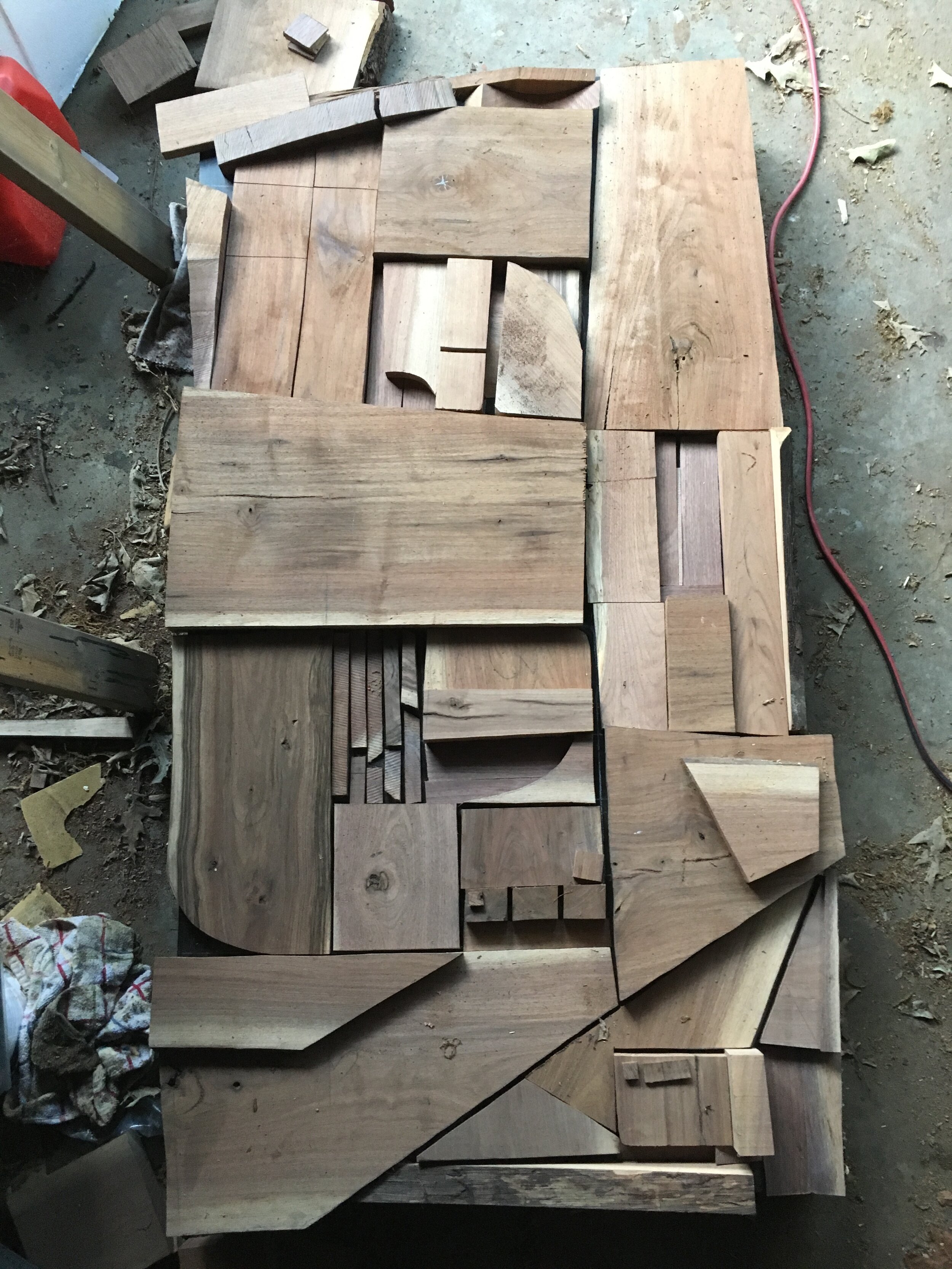
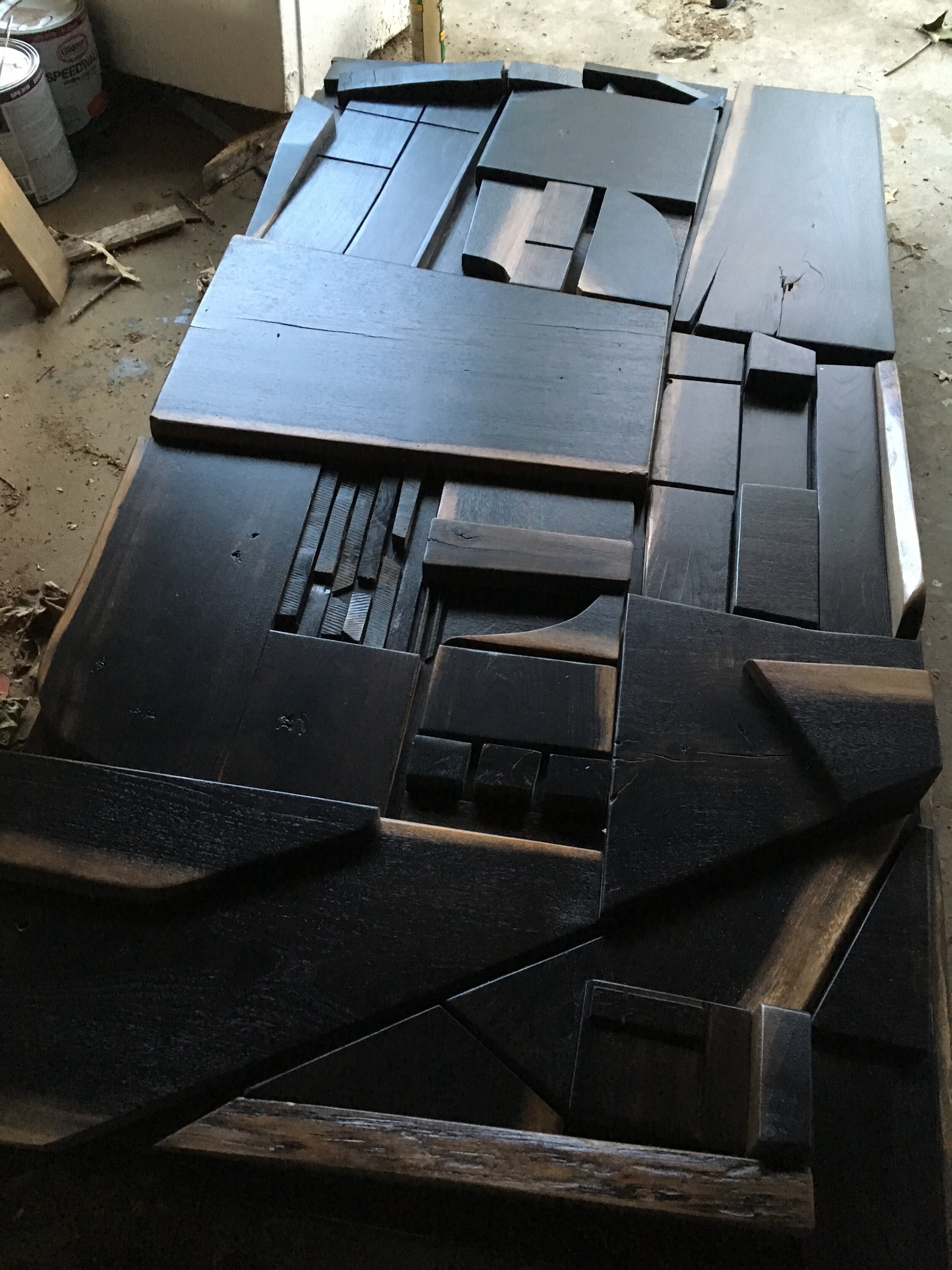
In terms of emotion, I wanted there to be a sense of coolness (as in cold) but strength. Think Stonehenge surrounded by fog. I am also perpetually inspired by Louise Nevelson’s treatment of texture by washing over her pieces with all black or white. The walnut I had brought too much color variation, so I decided to use an ebonizing solution (vinegar and dissolved steel wool) as a light stain to mute it slightly.
It blacked it out completely. This was unexpected, but if you didn’t know, the metal reacts to the tannins in the wood. White oak turns almost blue, but pine does almost nothing. Walnut apparently has a lot of tannins. So I rolled with that and went with a more Nevelson vibe.
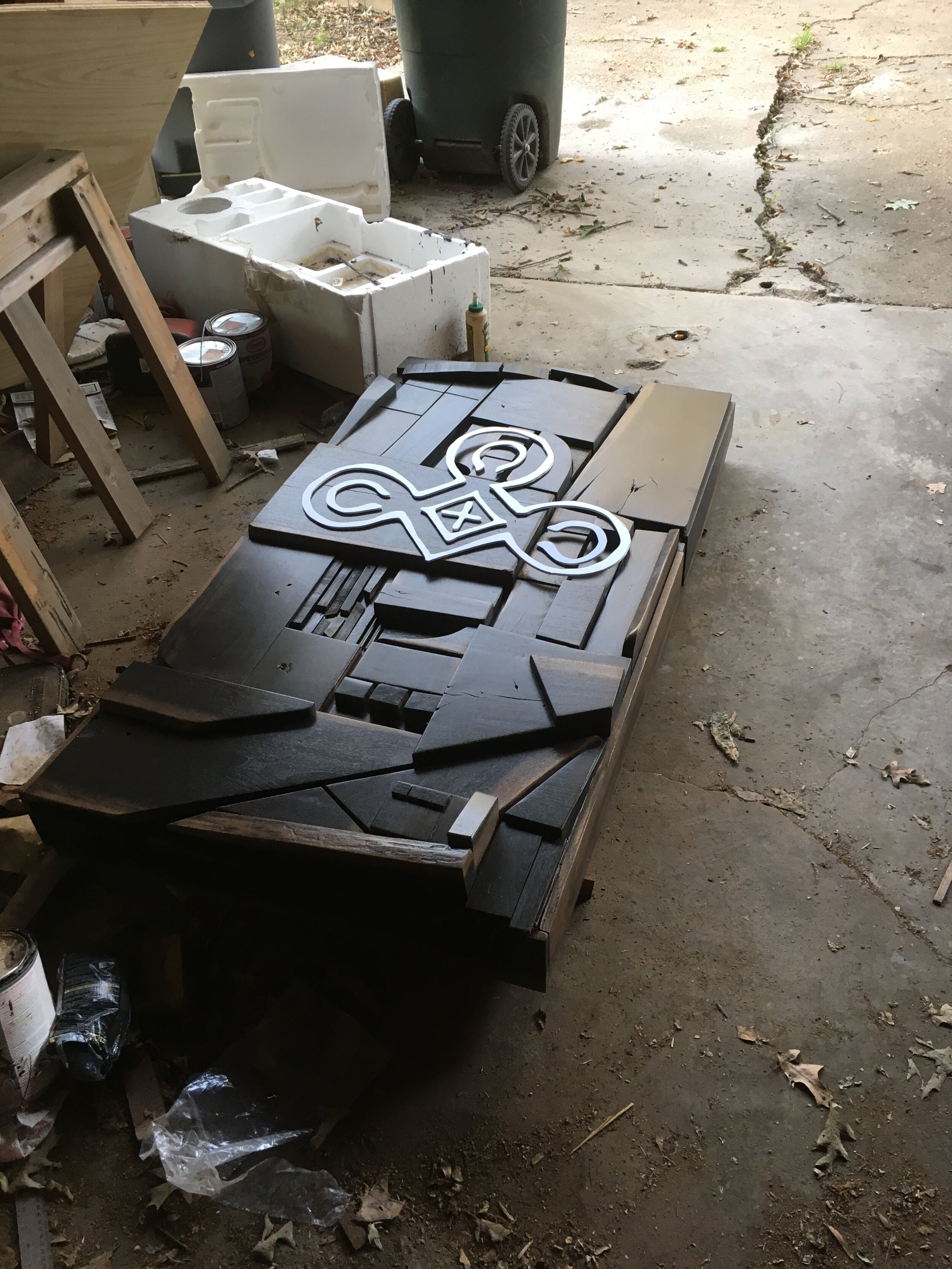
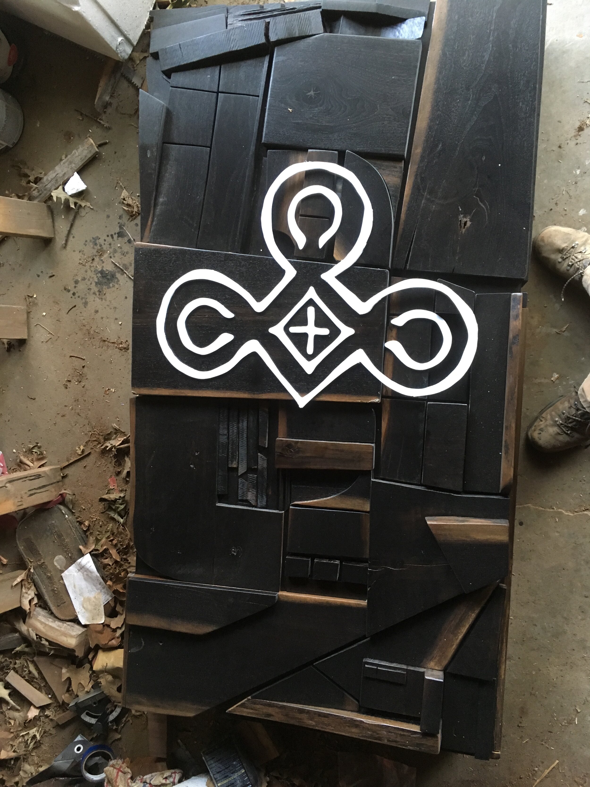
After a fancy polyurethane finish afforded to me by my employer at the time (Woodland Tree Service), I got to work on applying the verbiage. The logo was already created, so I transposed that onto foamcore, where I then cut it out. This took much longer than I expected. After attaching the logo to the work, I hung it in the space.
In hindsight, I had a different image in my head of what the actual space was. I think I expected more natural light (the Stonehenge thing again), so upon arrival, I immediately noticed that in a dimly, warmly lit space, this thing is giant and dark and heavy. Maybe even intimidating. I might’ve made some different color decisions if I had to do it again, but ultimately, I think the light of the logo snapping sharply off the soft blackness is something that resembles Christ City in a way. I am proud to be in a church body that values having a huge brooding art piece as it’s first impression. It’s not afraid of beauty or of heaviness.